


ForD Avenue Façade System Upgradation
Client: ForD.
Location: No. 9 Feiyunjiang Road, Shangcheng District, Hangzhou City, Zhejiang ProvinceCompletion Date: 2025
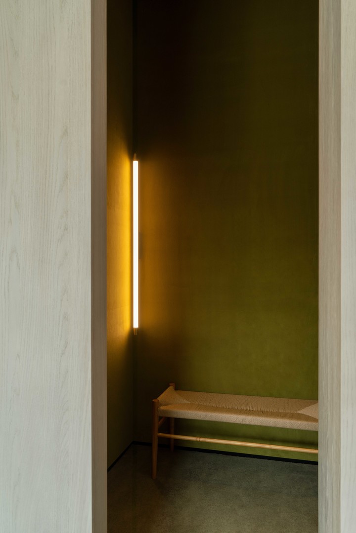
Golden Curtain
金色帷幕
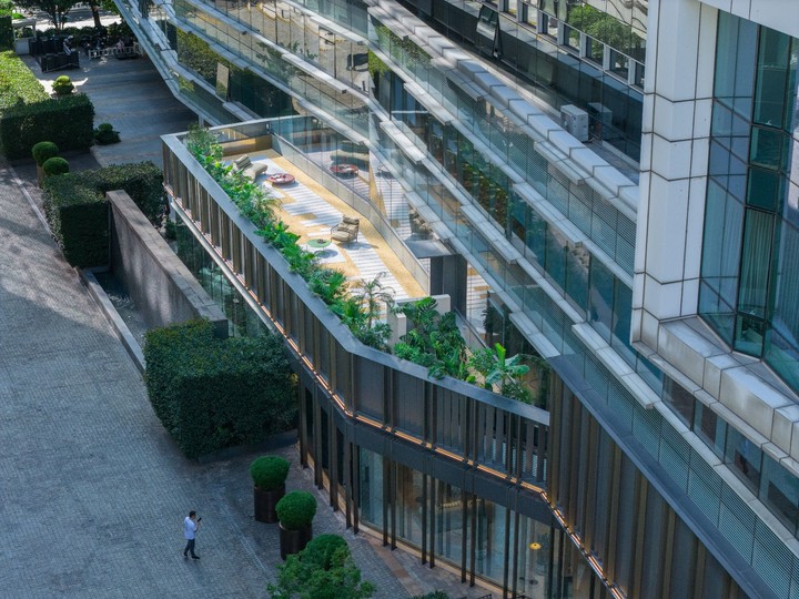
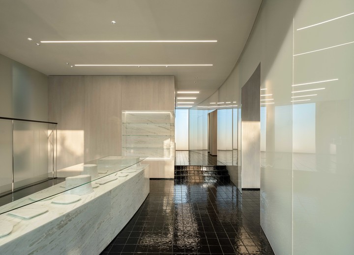
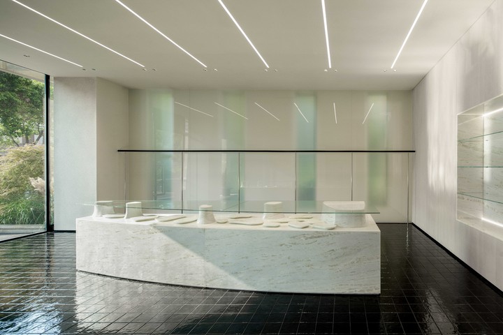
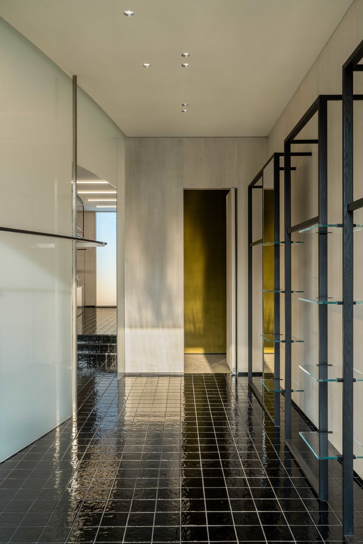
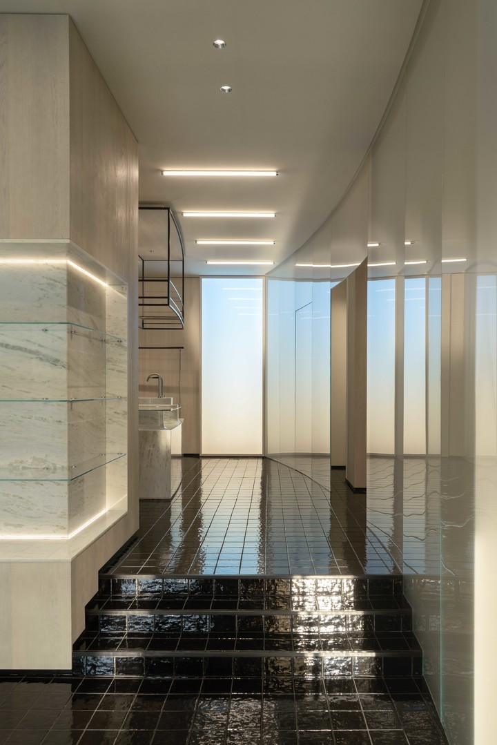
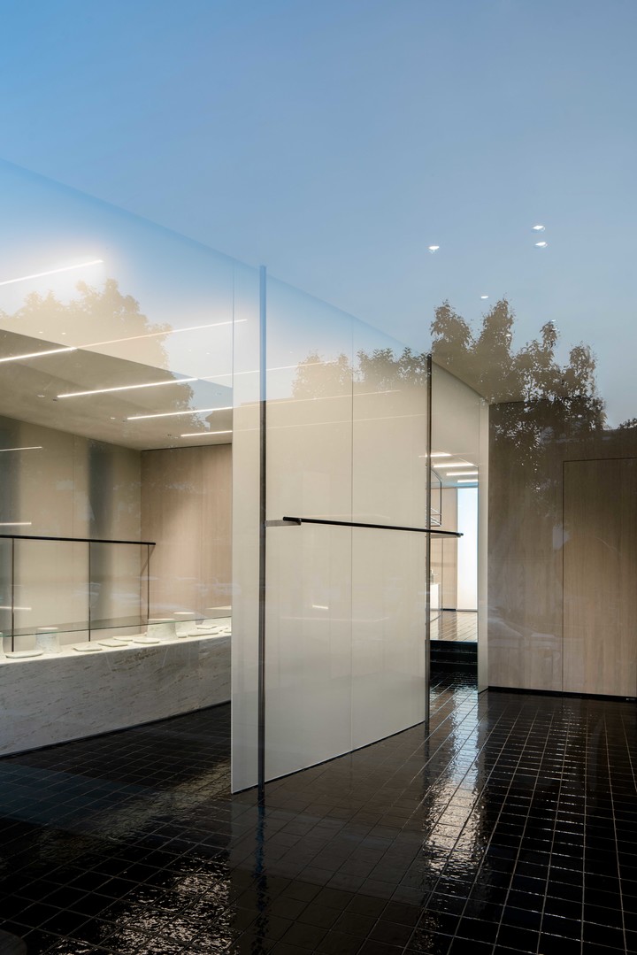
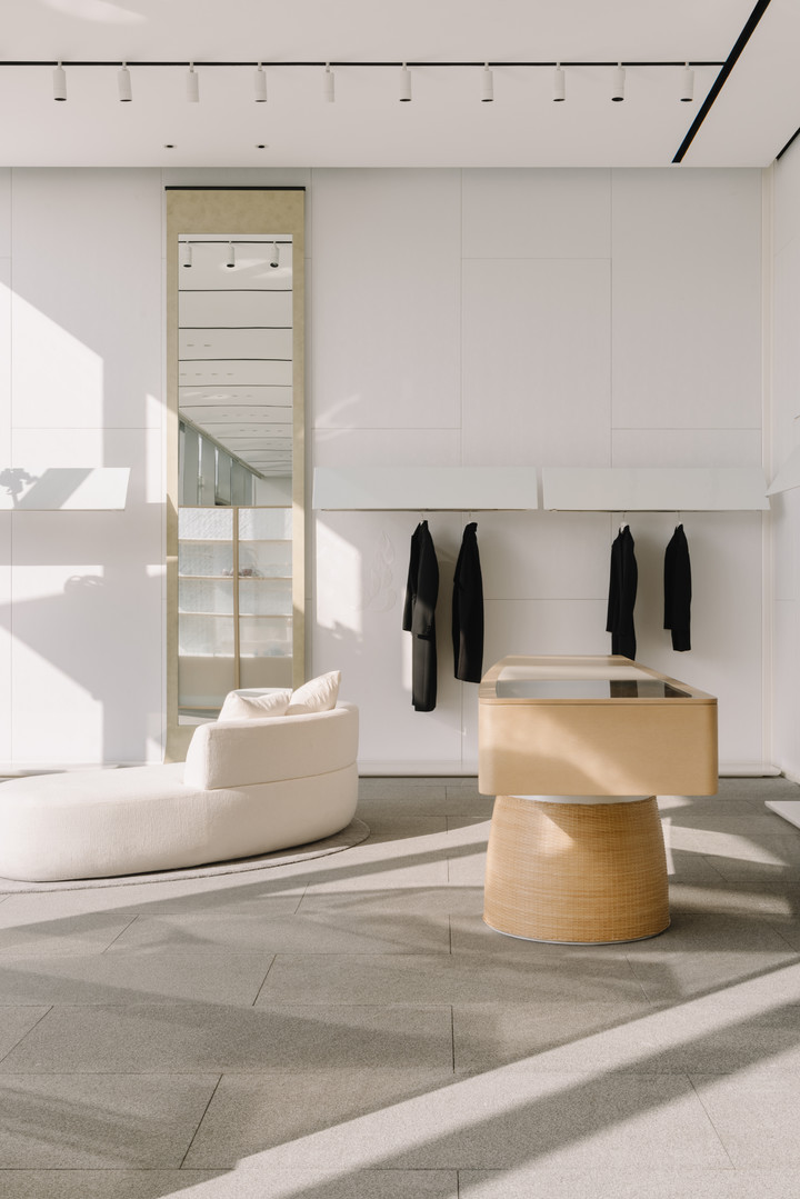
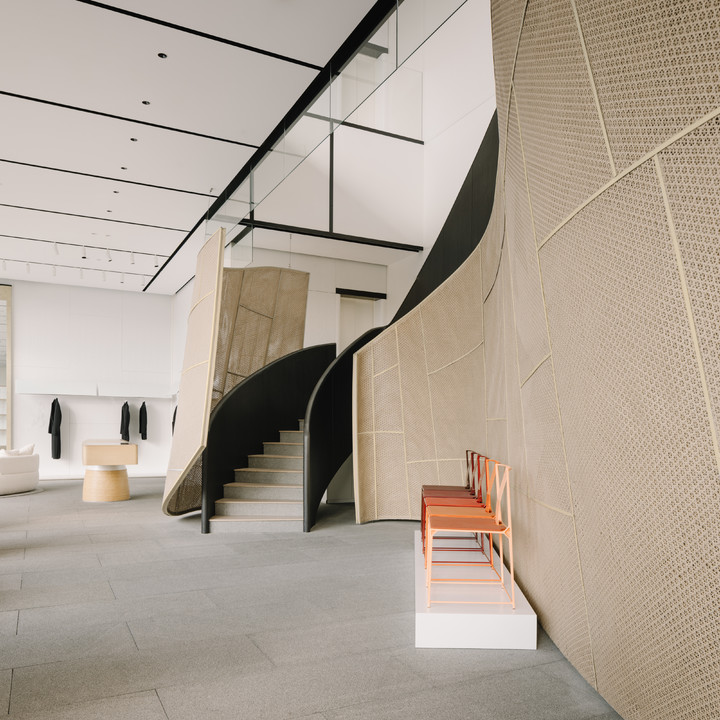
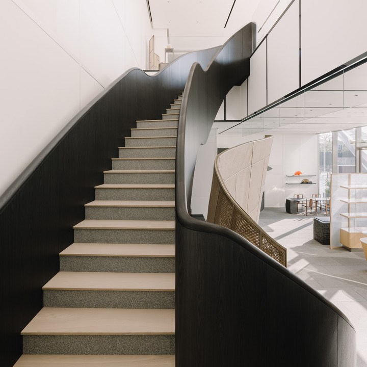
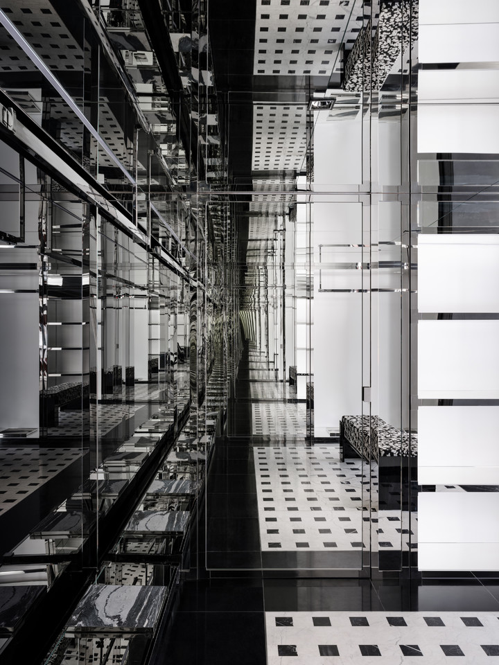
ForD. has upgraded its flagship store into ForD Avenue, a 15,000 m2 destination that brings the world’s leading home furnishing brands—forming a new luxury homeware community following Milan’s Durini. Responding to the expansion of both scale and display, the brand required a refreshed architectural identity. Say was commissioned to redesign the façade system, developing an approach that integrates brand recognition with design logic, infusing ForD Avenue with a “Golden Ambience.”
福邸国际将其旗舰阵地升级为约1.5万平方米的福邸福街,汇聚全球顶尖家居品牌的独立旗舰店,成为继米兰杜里尼(Durini)大街后奢侈品家居品牌集群。面对空间尺度与展示界面的扩大,品牌亟需一个与之匹配福街的全新建筑形象。say担任其建筑立面系统更新设计,以一套融合品牌识别与建造逻辑的立面系统,为福街注入“金色氛围”。
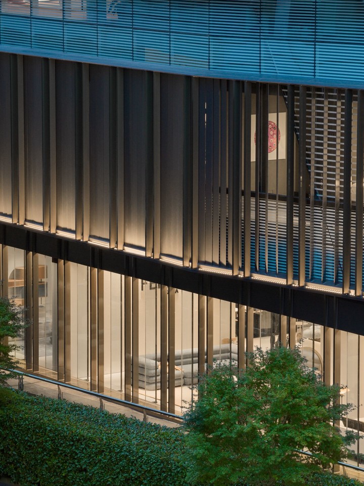
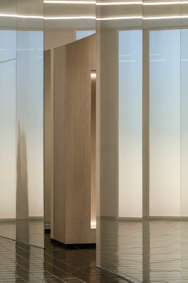
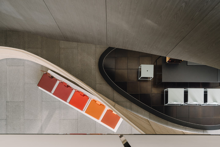
For this upgrade, Say proposed a design that balances the brand’s character with the need for efficient construction. The building was as if gently wrapped in a golden veil, created through groups of fixed metal panels in a well-considered composition. By adjusting the density and spacing of the vertical metal components, a subtle gradient and rhythmic visual effect were created.
在本次立面升级中,say提出了一套兼具品牌气质与高效落地双重需求的立面系统。整体建筑犹如被一道金色帷幕温柔包裹,该系统利用上下固定的金属板,通过控制竖向金属构件的疏密排布,形成渐变的视觉节奏。
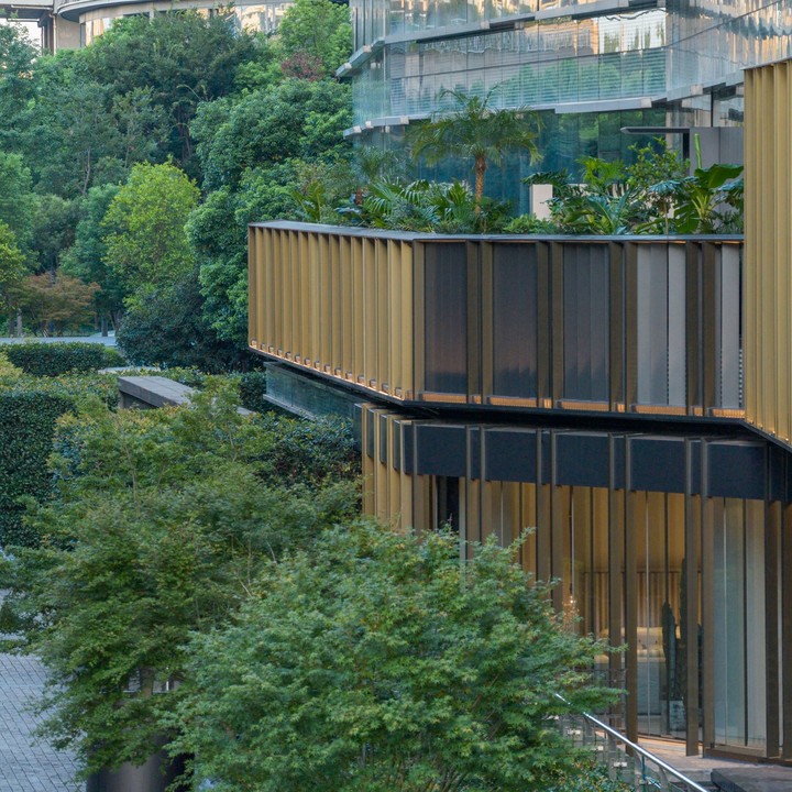
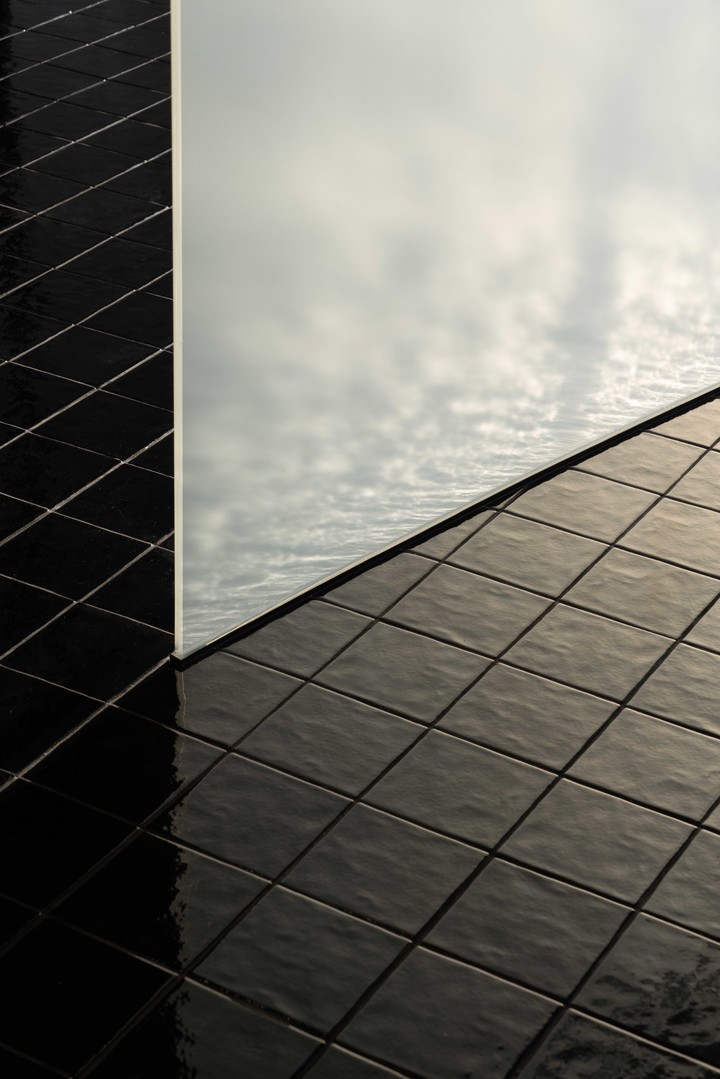
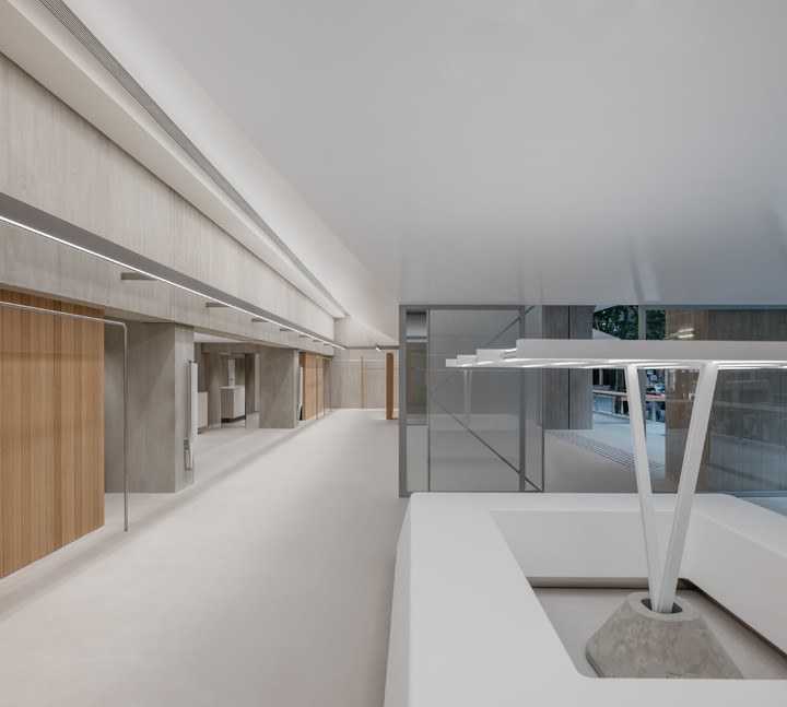
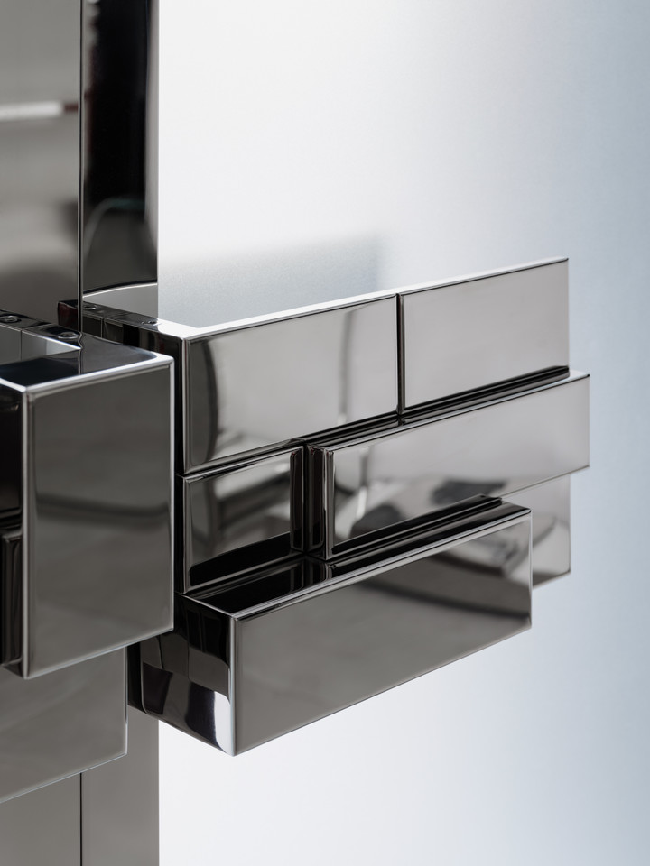
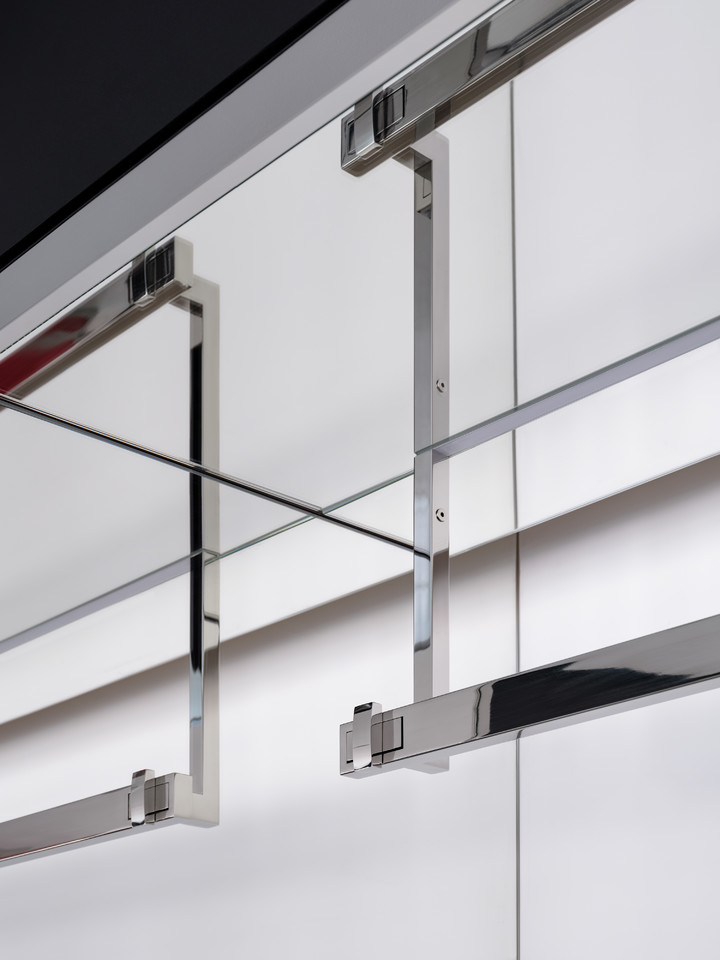
To accommodate the wind-load condition from the Qiantang River, all vertical elements are designed with a triangular section, which increases wind resistance and structural rigidity while maintaining the overall lightness of the wall.
为适应钱塘江畔风压环境,所有竖向金属构件均采用三角截面设计,在保证幕墙整体轻盈感的同时,有效提升抗风稳定性与结构刚性。
During on-site construction, installers simply align each vertical component with the predefined module on the top and bottom metal rails and snap them into place to complete the assembly. This façade system has significantly simplified the on-site construction workflow and enabled installation to be completed within a week. Through the use of standardized module, Say achieves the balance between construction efficiency and aesthetic performance.
在实际的施工中,作业人员仅需将构件沿上下固定的金属板按照轨迹逐一组装、卡入锁定,即可完成整体安装。该立面系统极大简化了现场作业流程,整体安装时长也仅耗时一周,say通过标准化构件实现了施工效率与观感美学的平衡。
The alternating composition not only established rhythmic expression across the façade but also mediated the invitation of river views and natural light into the interior, creating an organic dialogue between architecture and its environment.
金属构件的虚实排布,不仅构建出立面的韵律变化,更将江景与自然光线有序引入室内空间,形成建筑与环境的有机互动。
The unveiling of the“golden curtain” has rebuilt the visual identity for ForD Avenue, but also marks the brand's strategy transformation from isolated flagship stores to an integrated urban retail district. It signifies the new phase in which ForD leads—a curated collection of premier global home furnishing brands, into the next stage.
帷幕的拉开不仅为福街塑造了标识形象,更见证了品牌从点状旗舰店到片状场域的战略转型,标志着福邸带领着这片汇聚全球家居精品的滨水场域迈入全新阶段。
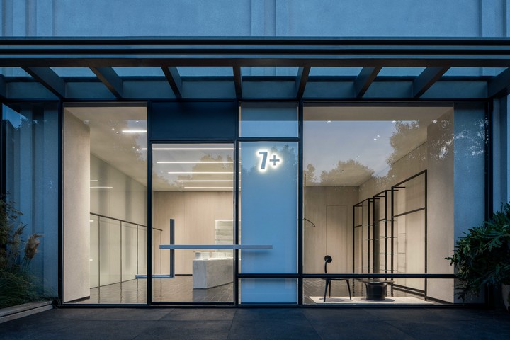
7+ Selcet Shop
Client: 7+
Location: Zhengzhou , HenanCompletion Date: 2025
Area:160 sqmGlimmering Bay
微光水岸
Located on Xinhua South Street in Zhengzhou, the project is a women’s fashion retail space that turns imagination into reality, showcasing aesthetic curiosities all around the world. Say draws inspiration from Zhenzhou’s deep connection with rivers, translating the idea of “River” into the spatial framework. Creating a lucid and inclusive spatial realm where each garment is a stone in the flowing stream and where light and shadow move, weaving an immersive journey of aesthetics.
项目位于郑州兴华南街的街边一隅,是一处将想象变为现实的综合女装零售空间,旨在呈现世界各地关乎审美的趣物。这次,say从郑州与河的渊源中汲取灵感,将“河”转译为空间的骨架,为其打造出清澈而包容的场域,让每一件衣物如溪中石,在光与影参与其中,共同编织这场沉浸的审美旅程。
The floor-to-ceiling window opens the space, inviting natural light and the greenery of the streetscape indoors. The spatial narrative unfolds along a curving wall that flows with ease, like a tranquil stream, dividing left and right zones, while connecting front and back. Its smooth surface captures shifting light and shadow, guiding visitors’ steps through the space.
入口的落地玻璃是空间的序幕,将自然光与街景绿意一同邀入室内。空间的叙事沿一道弧墙展开,它如一道从容的水流,自然划分左右区域,又巧妙地连接前后。光滑表面微漾光影,引导访客的步伐。
On the left side of the front area, a marble island is the first peep of the concept, mimicking an estuary. The irregularly shaped stone imitates pebbles left behind as water flows across a Tidal Flat. Trees gently sway, the blurred silhouettes filtering through a frosted glass wall, framing a living drawing of light and shadow.
前场左区,被置入了概念的起点——一座形似入海口的大理石岛台。台面上不规则凸起的石体,像是水流漫过滩涂时沉积的石块。当室外绿树因风摇曳,一侧整面磨砂玻璃墙透出朦胧树影,与之构成一幅动态的光影画。
The black handcrafted brick tiles softly glimmer in the light, like a damp shoreline revealed as the tide recedes.
黑色手工砖地面在光照下泛起微光,好似潮水退去后湿润的沙滩。
On the right side of the front area, a resting place is provided. Clothing pieces are arranged between black rods and transparent glass panels with a sense of lightness and order.
右区设有一处可供小憩的角落,服饰在黑色直杆与通透玻璃板的组织下,呈现得轻盈而有序。
At the end, the fitting rooms are wrapped by grass green, forming an idea of an oasis.
尽头被草绿色包裹的试衣间,形象化了林中绿洲的概念。
Following the black handcrafted tile steps into the rear space, the central island extends the idea of Waterfront, functioning as both a bar and a display counter. Overhead, a delicate framework of black metal rods and glass defines an airy structure which acts as a light-capturing vessel.
沿着黑色手工砖铺就的台阶步入后场,中心岛台延续了“水岸”的概念,兼具水吧与陈列功能,上空以黑色杆件与玻璃构筑出轻盈的架构,成为捕捉光线的容器。
From Tidal Flats to Bay, from flowing curves to diffused light, every detail resonates with the imagery of “Waterflow”, embodying 7+’s philosophy of transforming imagination into reality. This is not a collection of garments, but a harbor where aesthetics and inspirations converge.
从“滩涂”到“水湾”,从流动的弧度到弥漫的光线。每一处细节呼应着“水流”的意象,也承载着 7+将想象落地的品牌理念,这里不仅是服饰的集合地,更是审美与灵感的交汇港。
While the city’s bustle remains outside, the tranquil bay glimmers within, writing poetry with words of space, and sending emotions with letters of clothing. Say envisions every styled traveler would make a stop here, discovering their personal way of expression.
当城市喧嚣在外,这一方清透水岸始终亮着微光,以空间写诗,用衣语寄情。say希望每一位风格旅人在此停泊,寻得属于自我的表达。

DENSE&LIGHT Office
Client: DENSE&LIGHT
Location: HangzhouCompletion Date: 2025
Area: 470 sqmThe Weaving Theatre
织作剧场

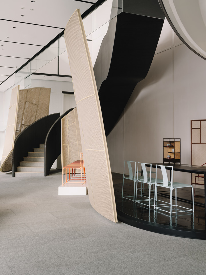
DENSE&LIGHT Office located on the top floor of a commercial building adjacent to the Qiantang River. The owner expects the space to serve as both an office and a showroom. DENSE&LIGHT has devoted to researching woven fabrics for over 20 years, aiming to consolidate the brand’s distinct woven art into space fabric, imagining a Woven Theatre.
浓淡展厅办公室位于钱塘江畔写字楼顶层,业主期望是兼服装展厅与日常办公的综合办公空间。品牌专注研究编织面料20余年,say将品牌独有的编织艺术融入空间肌理,构建一座“织作剧场”。

The space spans the north and south sides of the building, with an entrance positioned at the centre, separating the site into distinct functional zones. The north side serves as basic office space while the south side dedicated to showcasing fabric samples and ready-to-wear collections.
空间贯穿建筑南北两侧,办公室入口在中央,有效地将场地功能做直接划分,北侧为基础办公后台,南侧则作为品牌面料样品及成衣的展示舞台。

Thousands of hand-crafted ceramic tiles are stacked and interlocked to mimic the woven texture.
入口处,数千块手工烧制的瓷砖重叠拼合的方式,模拟出面料编织的纹理.

The surface guides visitors inward, the reception area functions as the foyer of the entire space, like the prologue of a theatre delineating the ‘on stage’and‘backstage’of office functions.
沿弧形墙面引导进入,便可看到接待区作为了整个空间的前厅,好比剧场的序幕,清晰分流了“台前”展示与“幕后”办公。

Upon entering the main showroom, a matte-textured arched opening impersonates a swept drape, dividing the theatre into five sequential scenes.
步入主展厅,磨砂弧形门拱如同徐徐拉开的帷幕,将剧场依次分隔为五个递进式场景。

As the spatial layers unfold, they create a sense of ritual around presentation of fabrics and collections.
空间层次渐次展开,为品牌的面料与成衣陈列赋予仪式感。

The semi-translucent arches remain open, allowing natural light to permeate the interior. A brick-red carpet contrasts with the soft translucency of partition walls, creating a dynamic balance between intensity and subtlety. A wave-shaped wood clothing rod draws attention to detail, adding a sense of warmth to the space.
半透的拱门保证开敞空间的同时,让自然光线在室内贮存,深红的地毯与朦胧的隔断形成浓与淡对比,波浪纹的实木挂杆凸显细节,浓淡相宜,为空间增添温度。

‘Backstage’office area provides infrastructures for basic needs. The chosen wall panels of the meeting room, live room and conference room resonate with the brand’s core language.
后台办公区满足了品牌的日常用工需求,而会议室、直播间、洽谈间等功能空间,其饰面细节上同样呼应了品牌的核心语言。

Circular layout enhances the flow efficiency and makes an emphasis on the‘On and Off Stage’ spatial relationship of the Woven Theatre.
环形布局优化动线效率的同时,强化了剧场中“台前幕后”的空间关系。

The theatre-alike design adds narrative to the product showcasing.
剧场式展厅设计为产品的陈列增加了故事性.

The stack and interlock ceramic tile art at the entrance articulates the space and brand’s essence.
入口的拼贴让编织的艺术由内而外进行了串联。

Through the process of functional divergent and display cultivation, say established the stage for a woven drama between fabric and space — await its opening act.
say通过功能分流与场景的营造,让一场关于面料与空间的织作戏剧静待启幕。

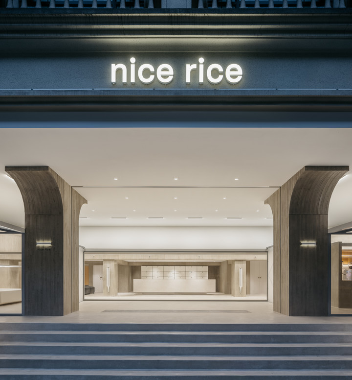
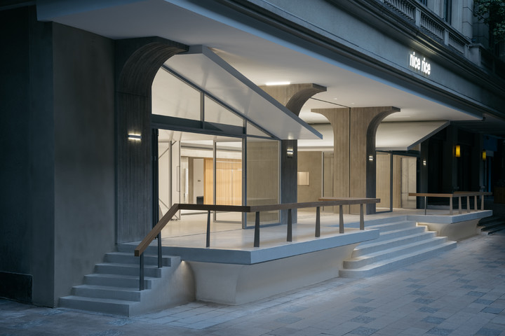
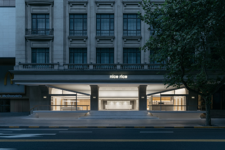
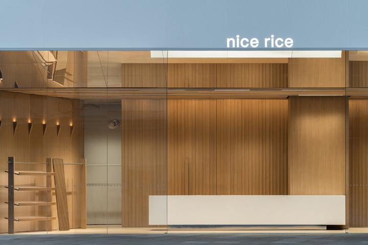
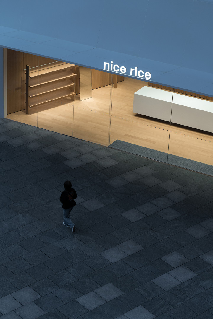
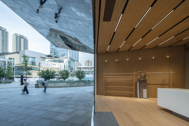
nice rice Chengdu Concept Store
Client: nice rice
Location: Chenghua District, Chengdu, ChinaCompletion Date: 2025
Area: 310 sqmUnder the Tree Canopy
大树底下好乘凉

Chengdu’s urban fabric is woven together by activities such as listening to opera, drinking tea, visiting gardens, and enjoying scenic views. “To rest under a large tree canopy” is a saying that reflects the relaxed essence of daily life in Sichuan and Chongqing. The leisure lifestyle under trees conveys a sense of content and comfort.
听戏喝茶,游园观景,织造着独属于成都的文化底色,大树底下好乘凉,是融于川渝市井的生活本味,树荫之下的休闲生活带着天然的惬意与舒适感。

The store has relocated from its original location on the first floor to a second-floor space. Since the increase in size, Say expands the concept of the “opera watching and tea drinking” tranquil lifestyle into the new space by mimicking the dappled lighting effects using light films.
门店由原始的一层面门搬迁至二层空间,随着空间尺度的增加,say将听戏喝茶生活的涉及面扩张,通过智能灯膜打造疏漏的光斑,将树荫下的安逸生活带入全新空间。

The original site has lots of edges, and the complex edges cut the site into multiple spaces.
原始场地转折繁多,复杂的转角将分割出多个空间,戏台的置入为空间带来了更便捷高效的体验流线

he wooden opera stage was assembled with wooden tapered columns and hanging rods. The opera stage installation spans across the entire space, eliminating the irregularity of the edges. The assembled structure is quite simple with tapered columns connecting hanging rods, forming a unified object.
通过木质梭柱和挂杆组装,搭建出一个极简的“木质戏台”,整座戏台装置横穿整个空间,将四周棱角带来的不规则感削弱,拼装结构极简,梭柱和挂杆拼接连贯,形成统一整体。

Overhead spotlights cast light onto the ceiling of the opera stage, bringing the dappled lighting effect creating a visual impression of being shaded by a tree canopy. The interplay of ever-changing light spots and the wooden structure infused the static space with natural rhythm.
顶部的射灯投下光线,将模拟的“树荫光斑”映射至戏台顶棚,让戏台形成笼罩在树荫之下的视觉感,光斑的多变与木质戏台的联结,赋予静态空间以自然呼吸的节奏。

Entering from the mall, walking through the opera stage, choosing clothes, the light film at the stage ceiling shifting patterns of light, mimicking the natural light and shadows as if beneath a canopy, casting patches of light spots flowing in the space.
由商场进入,沿着戏台穿梭,选购服装,戏台顶部的灯膜模拟自然的明暗变化,树影婆娑,漏下连片的光斑在空间中无声流动着,树荫的庇护感与天然的凉意顺着戏台的路径深入空间。

Visiting inward, the space gradually leads to a broad central atrium. Visitors passing through an array of shades, the light brightens. The glazed facade invites natural light into the indoor, views expand along. On the stage, flows a sense of nature, off the stage, lives a calm and spontaneous life.
一路向内游玩,空间逐渐引向开阔的中庭区域,来访者从连排的树荫下穿过,光线豁然明朗。通透的玻璃幕墙将丰沛的自然光引入室内,视野也随之打开,戏台之上是流动的自然,戏台之下是随遇而安的闲适日常。

The brand continues using white as a base tone while the wood framework acts like a flowing spine, drawing together and connecting the entire space. Light spots flicker and shift across the film, softening the sense of artificiality of the installation.
品牌一贯的纯白色作为基调,原木色的框架如同一条灵动的脊梁,收拢串联整个空间。灯膜上的光斑流转跳动,减少了装置模拟的机械感.

Say hopes the tranquil rhythms of “To rest under a large tree canopy’’ blend with the brand’s language, through the weaving circulation and moving light film, bringing an infusing, vivid light and shadow opera.
say希望将大树下乘凉的闲适韵律与品牌语言相融合,通过蜿蜒的动线与动态灯膜,串联起一幕步入式的、充满生机的光影戏剧。

YEK Shanghai Pop-up Store
Client: YEK
Location: Grand Gateway 66, ShanghaiCompletion Date: 2024
Area: 65 sqmSlash Playground
斜杠游乐场

YEK launched a pop-up store in Shanghai, serving as an offline stage for kid slashers. Say integrated the diverse lifestyle of kids slashers into space design, transforming a shopping scene into a vibrant leisure scene through the “/” symbol, creating an amusing playground for slashers.
YEK在上海开设限时门店,作为斜杠儿童们的线下舞台,say将斜杠儿童的生活轨迹融入空间,通过“/“(斜杠)的变形,将购物空间切换成休闲生活场,打造了一间趣味的斜杠游乐场。

The space reimagined, magnifies the “/”symbol, turning it into a sleek, lightweight metal pipe that weaves through the environment, drawn from the boundless imagination and vibrant energy of children, leaving a jubilant trace.
空间将“/”的想象拉长放大,变换成一根轻巧的金属钢管,如同孩子们跳跃的思维和旺盛精力,在空间穿梭滑行,留下一路欢悦跳脱的轨迹。

The metal pipe undulates and intertwines, forming a series of slides, rollercoaster-like curves, and climbing frames. Seen through the lens of a child’s eyes, sparks of inspiration travel along this path, blooming inward as they go. Each stop becomes a functional element: display counter, shelving units and fitting rooms.
金属钢管的轨迹高低起伏,蜿蜒生长,形成充满趣味的滑梯、过山车、爬爬梯。戴上儿童世界的眼镜,看着灵感的火花沿着这条轨迹,一路向内绽放,逐一留下的标签点生成展台、陈列架、试衣间。

The hand-craft metal pipe allows high flexibility and more creative potential, while more design thinking lies in the thoughtful details.
手工焊接的钢管带来高度灵活性与创造可能,而更多趣味的巧思,则在细节处展现。

Driven from the curve of a roller coaster, the central meandering clothing racks have slots for hanging.
中央蜿蜒的陈列衣杆模拟过山车的轨迹,设置卡槽便于服装悬挂。

Every bends and turns were infused with the brand’s spirit, showing precise and distinctive craftmentship.
金属杆的每个转角处,结合品牌气质,通过挤压转折,打造更加分明硬朗的棱角。

Movable tablets are placed in both the fitting room and central display for more outfit inspiration.
试衣间与中央陈列区旁各设一台活动平板,为挑选服装的小朋友提供穿搭灵感。

The original site is located in the atrium of a shopping mall, with an open ceiling, and lacquered aluminium-made grid panels curved allowing natural light to flow into the space. Light fixtures are discreetly integrated within the aluminium panels, minimizing visual clutter and eliminating the need for excessive ornamentation. This approach creates a clean, refined atmosphere that emphasizes simplicity and a return to essentials.
原始场地位于商场中庭,顶部不设封闭天花,烤漆铝板搭建镂空格栅,同时设置弧角,确保自然光线从顶部流入空间。而照明灯具同样隐藏在铝板中间,避免了繁杂装饰对视觉的干扰,带来去繁就简、回归本质的纯净感。

The path of growth is a curvy journey full of surprises with initiative climbs and brave slumps, where every rise and fall traces the course of exploration. A single “/” metal rod threads together all kinds of facets of a kid slasher’s life.
成长的路径是充满惊喜的曲线,有主动的攀爬与勇敢的滑落,上下起伏都是探索未知的轨迹。一根“/”金属杆串联起斜杠儿童各种生活场景。

Here in this playground built with imagination, say encourages children to roam and explore, embracing their individuality with freedom, joy and endless sense of wonder.
say希望在这座由灵感想象搭建的游乐场里,鼓励孩子们自由奔跑、大胆尝试,特立独行的小孩同样自由、欢畅、充满惊喜的。

DEEP BREATH Guangzhou Flagship Store
Client: DEEP BREATH
Location:Canton Tower PlazaCompletion Date: 2024
Area: 181 sqmBreathborne Hill
氧气山丘

DEEP BREATH has unveiled a new flagship store in Guangzhou. The brand has been devoted to crafting comfortable cashmere wear. In response, say traced the origin of cashmere, drawing inspiration from nature’s purity and breathability of cashmere. This essence was translated into the spatial language of the store, creating an ethereal “Breathborne Hill”.
DEEP BREATH深呼吸在广州开设全新的形象门店,品牌一直以来致力于打造舒适的羊绒产品,于是say从材料溯源,追寻羊绒的发源地,将自然的纯粹与可呼吸感转化为空间的核心语言,打造了一个轻盈的氧气山丘。

The wooden handles at the entrance are textured with gentle folds, as the scroll unfurls the narrative of hills, where the exploration of nature starts.
入口的木把手肌理褶皱,作为打开山丘画卷的卷轴,对自然的探索由此出发。

The display racks and experiential spaces interweaved, while undulating curves enclosed the fitting area, the outer folded texture, mimicking scattered haystacks across a natural landscape.
整体陈列架与体验空间穿插布局,突出的弧形起伏围合成试衣空间,外层肌理褶皱,模拟模拟零星点缀在山丘的草垛。
The rolling panels enhanced spatial rhythm, while the patterned floor tile resembled the crotched stone clusters, creating an organic and engaging visual experience.
凹凸的板块划分增加更动态游览,拼花地砖则模拟多棱角的山丘石堆,呈现更自然有趣的视觉体验。

The meandering wooded dropped ceiling simulates a hilly landform, flowing rhythmically and wrapping the upper perimeter of the space. The entire structure is recessed into the wall, with a cantilever design ensuring a clean presentation. The perforated ceiling appears light and breathable, evoking a sense of effortless movement.
蜿蜒的木格栅吊顶环模拟山丘地形,起伏流动,环绕整个空间顶部,整体采用墙面预埋,悬挑结构确保了干净的展示。片片镂空的吊顶轻盈,呼吸穿梭,带来无拘无束的轻快感。

The walls are designed to display cashmere products, the surface is adorned with the delicate texture of knitted wool-an architectural language of warmth and softness.
墙面的设计则贴合羊绒展示品,将羊绒针织的肌理覆盖于墙上,是温暖与柔软触感的空间化延续。

Fine leather is wrapped in the centre core display, offering protection and a heightened tactile experience for customers.
中央核心的羊绒展示台,同样覆以触感细腻的皮革,保护产品的同时,为购买者带来更舒适的体验。

The structure of hills is light and rolling, ethereal materials matched with low-saturation colours, achieved a gentle, tactile quality. The bright and open façade framed the interior like a canvas, enclosing the space making contrast with the urban hustle and pretenciousness of the shopping mall. Inside the picture frame, organic wood and airy ambiance marinade a calming retreat.
山丘的结构轻盈而流动,细腻的材质与低饱和色彩搭配,则赋予了空间柔软的属性。干净敞亮的外立面犹如画框,包裹整个空间,与城市的匆忙和商场的精致不同,这个画卷内里轻盈,木色自然,是一个让人放松的场所。

Say aims to amplify the brand’s value of lightness and calming feelings tangibly and intuitively. The expression of this “hill” goes beyond its physical form. It blends the well-curated sensory experience into the shopping experience, infusing air into the space, and allowing customers to engage with the ecological narrative, where they can feel the essence of the brand and take a deep breath.
say希望通过设计,更加直观地放大品牌传递的轻盈与舒适感。这座山丘的营造不仅仅在物理道具上表达,而是结合细致入微的体验,为山丘注入氧气,让购买者成为生态叙事的一部分,感受自然的深呼吸。

say architects Shanghai Office
Client: say architects, Luximorph
Location: ShanghaiCompletion Date: 2024
Area: 290 sqmExtension of the Community Office: Urban Terrace
新世界2.0

say architects Shanghai has settled in Columbia Circle Phase 2, joining Luximorph to create a collaborative workspace. Say envisions integrating the design essence into the space and seeking to cultivate an open, vibrant Jardin, exploring innovative possibilities.
say architects新办公室入驻上海上生新所二期,与Luximorph开启的协作办公空间,say希望将上生新所的设计底色融入空间,打造一个充满自由活力的开放花园,探索设计的多种可能。

The office is located on the south-facing second floor of the Columbia Circle Phase 2, featuring a row of full-height windows, which allows abundant natural light to flood the space and extends the greenery from the community’s corridor into the space. At the entrance, a set of material display walls sections the space, while defines a mini garden window, serving as a screen of the office area.
整座办公室位于上生新所二层朝南侧面,成排的玻璃落地窗带来充足的阳光照射。社区的连廊一路爬满绿意,一直蔓延至室内。入口处由连排的材料展示墙,分割出一个微型花园橱窗,同时作为整个办公区的遮挡墙面。

Stepping inside, the open working area is positioned in the centre, and the communal space forms an L-shape, enclosed the working area. Following the pathway through the communal space, leads to the reception area and a water feature. A linear shaped island counter serves as a subtle divider, delineating distinct pathways for dynamic and static functions.
推门入内,开放办公区安置于中央,公共空间则呈L型,将办公区域围合,沿着公区的路线向内参观,即是提供招待的水景区与会客室,长条的一字型岛台作为二者之间的软隔断,自然分离出动静两条功能路线。

The dynamic communal space serves as a reception and exhibition, as moving inward, the decoration and colour scheme soften, aligning with the refined atmosphere of a gallery.
动态的公共区域承载会客与展陈两个功能,逐渐向内,装饰与色彩趋于平和,贴合展厅的设计氛围。

The left-blank wall and corridors of the atrium brought an artistic stillness, offering a quiet pause that tempers external distractions. Behind this transition with curtains drawn back, reveals a secluded and comfortable meeting room.
中庭留白的墙面与过道,带来艺术性的沉默与停顿,将嘈杂与纷扰削减,短暂的缓冲过后,拉开门帘,是隐秘而舒适的会客室。

The static workspace features Say’s custom-designed long tables with no partitions between workstations to foster a more flexible and collaborative environment.
静态的办公区域,延用了say自主设计的长桌,取消工位之间的隔断,带来更自由的灵活办公。

The water bar counter incorporates a cut-out section, framing the view of the cedars and ferns, with lights filter through the glass that radiate the space with warmth.
背面水吧柜台的中间镂空,将窗外的杉树与蕨类框裱,光线透过玻璃,为空间注入更温暖的能量。

The left area is functioned as a meeting room. Sliding open the inner partition, the showroom can be used as sample storage, enabling hands-on interaction.
左侧的整个区域则作为会议室使用,拉开里间的移门,即是存储样品道具的展厅,会议的同时可提供实质性的道具体验。

The lush vegetation and metal structure meticulously refined the office, with precise craftmanship lending a sophisticated tactile experience. The integration of natural wood grains and stone texture subtly infuses the space with elegance.
整个办公室内只通过琳琅的绿植装点,空间所触及的金属结构,均做了极致的修饰,精细工艺带来细腻的质感体验,天然木纹与石材肌理的融入,则为空间注入了一点点隐匿的优雅。

When light creeps through the corridor, refracting onto the garden window, casting delicate shadow patterns that blur the boundaries between interior and exterior, intertwining their flow of narratives.
光线从连廊穿过,在花园橱窗形成折射投映,创造出微妙的光影效果,内和外的艺术语言在此刻连贯了起来。

With an enlargement of communal space, a more versatile environment has been introduced, where work is no longer limited to designated workspace.
公共空间的放大,带来了更加鲜活的场景功能,工作的活动范围不局限于办公区,软隔断只分割了功能区域,人对空间的探索却能无处不在。

Soft screens delineate functional zones without restrictions-allowing work, exhibition, and meeting to coexist. Say hope the new office serve as a space for unrestricted expressions, fostering a workplace that remains youthful, urban, bright, agile, and vital.
办公、展览、会客,空间的属性变得更加包容且随心,say希望新的办公室保持年轻化与城市生活感,轻盈、灵巧、富有朝气,成为一个自由表达的场所。

Wangchao Center Office
Client: DA DAO QI YUN
Location: Wangchao Center, HangzhouCompletion Date: 2024
Area: 960 sqmThe Unseen Contemporary East
不存在的当代东方

One Century(Hangzhou Wangchao Center) is designed by SOM (US), which is widely regonized as a perfect blend of high-functional performance designs and engineering.
望朝办公楼本身是由美国SOM建筑设计公司主持完成,作为高性能设计与工程的完美融合备受瞩目。

say architects(SAY) was commissioned by Dadao Qiyun to design a sample office space on the 15th floor. SAY aims to integrate Eastern philosophical thinking into the high-rise concrete jungle, emphasizing the natural rhythm and flow of the space, and creating an office environment that prioritizes comfort and experience.
say architects为大稻启运集团设计其位于15楼的办公示范空间,希望在高楼林立的大厦间,融入东方哲思,强调空间自然节奏与流动性,打造一个更注重人的舒适化体验的办公环境。

Based on the research of various office areas from different enterprises, and starting from the patterns of work and human behaviour within the space, the brief asks for two functional areas: the internal and external office zones. SAY separated the space into three main functional areas, with small and big demonstration offices on the sides, leaving a spacious central public area connecting the two office sections.The layout sets the foundation on a 300 x 300 grid, ensuring modularity and a sense of order within the space.
基于对现有市场上不同类型的企业办公面积的调研,以规律作业与人在空间中的实际行为为出发点,所需即是办公内外两种功能区,于是say将空间划分成三个主要功能区,两侧为大小的办公示范区,中央保留宽阔的路演公区连接两头办公区域。以300×300的网格为空间布置基础,以确保空间格局的模数化和秩序感。

The overall spatial layout uses a 1200mm or 1500mm wall panel, the traditional oriental culture accentuates the balance between the collective and the individual. By using modular components to build different functional rooms, the design creates a homogeneous yet fluid space that accommodates diverse activities and office environments.
整体空间布局上采用1200mm或1500mm的单元体墙板,而传统东方文化注重群体与个体的平衡,借用单元化构件去组合不同的功能房间,最终形成了一个均质且流动的自由空间,容纳不同的行为活动和办公场景。

To eliminate the suffocating feeling created by traditional separators, the wall panels are constructed with transparent glass, expanding the visual fields, while opening and brightening the space. This selection enhanced the coherence and the flow of the space.
为消除传统隔断带来的封闭感,墙板采用透明玻璃筑造,扩展了视野的同时,使空间更加开阔明亮,强化整体的连贯性与流动感。

The glass material allows light to travel through the space, maximizing natural light, ensuring a sense of transparency and comfort, and encouraging open communication and interaction.
玻璃的材质使光线在整个空间穿梭无阻,最大化利用自然采光,确保感官的通透与舒适,鼓励更自由的沟通与互动。

The rhythmic flow of light and shadow serves as a subtle yet abundant expression of Oriental aesthetics. Immersed in the environment, stillness contrasts with movement, and the relationship between people and the environment is harmoniously rendered. As light travels throughout the day, the atmosphere within the space continuously evolves, offering a dynamic and ever-changing aesthetic experience.
光影的交错与律动,是东方美含蓄而充沛的表达,置身其中,物静而人动,人与环境之间的关系被巧妙地调和,随着一天中不同光照角度的变化,室内的氛围也在不断更迭,带来时刻变化的多种美感。

As the first space upon entering, the public space has no traditional reception desk or formal greeting areas. The space is introduced by a circular sofa and a tea bar, simulating a relaxed living room. The Oriental approach to hospitality is inclusive and open, where guests are not seen as cold business contacts, but rather as friends being warmly received. The public area is impregnated with meaning beyond functionality; it represents the beginning of an emotional connection.
路演公区作为进入整个空间的第一个使用场所,取消了传统前台和形式化的接待,进门即是环形沙发及茶水吧台,模拟一个自由的居家客厅。东方的待客之道是包容开放的,来此的客人不是冰冷的商业关系,而是当做亲切朋友的拜访。公区被赋予了不止于功能的意义,更是一种情感的开端。

Entering the office areas, the vibrant working desks and natural wood accents soften the working space. To adapt to daily needs, the back of the workstation is adjacent to a movable water bar. Colourful soft furnishings brighten the surroundings, breaking away from the monotony of the office area, and adding richness and fun to the space. This design ensures those long-hour workers no longer feel restricted by the isolated environment.
步入办公区域,鲜亮的办公桌与原木的装饰让工作区域变得更加柔和,为贴合生活所需,工位背面即是活动的茶水吧台。多彩的软装点亮四周,打破了单一的办公室风格,使得整体空间更加丰富和有趣,让多数时间花在办公室的使用者,不再因为封闭的空间沉寂。

In the normal configuration, the wall panels are defined with partitions of various sizes including traditional office areas, flexible office areas, collaborative areas, meeting rooms and a tea room, all providing a secure and comfortable working environment. In the open configuration, the wall panels allow deconstruction and reassembly according to needs, creating a wider and comfortable shared space.
在日常状态下,墙板划分明确,大小不一的间隔涵盖了传统办公区,灵活办公区,协作讨论区,大小会议室及茶室等功能空间,提供安心舒适的办公环境;而在开放状态下,墙板拆卸重组,根据使用所需,组装成更为宽阔舒适的共享区块。

The removable panels provide a diverse layout and configurations. The interconnected volumes not only provide visual expansion but also infuse the space with a sense of movement. While the static panels maintain a sense of order, which the dynamic transition is a rare feature in traditional office space. With the flexible layouts, the space becomes a volume for functions and an expression. The shift from static to dynamic turns the office from a stale process into an innovative and vital experience.
可拆卸的隔板带来更加丰富的布局及模式,贯连的体块带来视觉伸展的同时,也让整个空间流动了起来。静态的隔板确保空间的秩序感,而动态变化却是以往传统的办公空间鲜少运用的。灵活布局下的空间变成了功能的载体,更成为一种表达方式。静态到动态的切换,让办公不再是一成不变的流程,而是融入创新与活力的体验。

ts special flexible layout feature, serves as the foundation of this sample office, while the intelligent design enhances the user experience by offering greater efficiency and convenience. Features such as meeting room booking, environmental monitoring, and smart controls seamlessly integrate with the distinct characteristics of each area, achieving a harmonious balance between technological intelligence and spatial design.
独特灵活的布局结构设计,作为这间办公示范空间的基础,智能化设计则在使用层面带来更加高效便利的体验。会议预约,环境检测,智能控制等,与不同的区块属性相融,实现科技智能化与空间设计手法的协调及统一。

The digitalized control system reduces the reliance on traditional panels, allowing users to effortlessly switch between different scenarios with one single click, transitioning between creation, collaboration, and relaxation. This enhances the overall experience. To maintain a clean environment, the design embedded fixtures as much as possible, minimizing the visibility of exposed components. Refining the structural joints and metal frames to achieve a balance between aesthetics and functionality.
数字化的控制方式减少了传统面板的使用,通过专属的设定模式,一键切换使用场景,在创造、协作与放松之间切换,带来更全面的体验。为了保留干净敞亮的空间,尽可能实现预埋,减少空间中固定件的外露,同时结构连接件及金属框架尽可能精细化,实现美观度与实用性的协调统一。

With an open and vital space, bringing a breathable office environment. The influx of natural light and open vistas brightens the areas, with the interplay of light and shadow, evoking the subtle flow of oriental heritage. Based on the concept of de-office-ification, SAY integrates an easy assembly model with colour aesthetics, offering a deep exploration of flexible collaboration and high-level intelligence, answering to the emerging trends in future office design.
空间疏朗,为办公的环境带来可呼吸感,开放视野和自然光的流入则让区域更明亮,光影流转,东方底蕴在其间缓缓流淌。say基于去办公化的核心理念,让便捷组装模式与色彩美学相融,是灵活协作与高度智能结合的深度尝试,同时亦是对未来办公设计趋势的回应。

Tagi. GATE M Shanghai Tagi House
Client: Tagi.
Location: GATE M, ShanghaiCompletion Date: 2024
Area: 135 sqmFurry Fun
它趣乐园

Tagi. has opened an offline pet-friendly space at GATE M Shanghai, welcoming pets to explore and experience inside the inclusive Tagi house.
Tagi.在西岸梦中心开设人宠友好的线下空间,开放包容的塔皮屋欢迎宠物前来探索体验。

Therefore, Say concentrated on the daily activities of pets, aiming to create a warm paradise for furry kids and their families.
于是say将更多的视角聚焦到宠物的活动轨迹中,希望打造一间共属毛孩子和家人的温馨乐园。

Matching building blocks were designed at the entrance. As the folding doors open, the staircase leads to different categories of products while dividing the layout into upper and lower floors.
积木拼贴门头,拉开折叠大门,台阶的置入分割产品类别,同时将空间的布局分为上下两块。

Both floors have circular layouts, beginning with simple accessories, and gradually expanding into the finer sections. Displays wrap around the handrail, with various pet products hanging along it. Transitioning into a living scene space.
双层环形布局,从简单的生活配饰,逐渐打开精细的划分,陈列顺着楼梯扶手环绕,悬挂各式宠物用品,过渡到更多元丰富的人宠生活空间。

The surrounding product display enhances the spaciousness and flexibility to the central activity stage.
四周环绕各式产品,中央的活动舞台更显灵活宽敞。

Pet bowls are provided at the entrance. Apple-shaped holes are embedded in the seating, satisfying pets’ need to explore.
入口处宠物专属水碗,沿窗坐凳提供休息的同时,底下设有孔洞装置,满足毛孩子的探索需求。

Gradually magnified apple shapes are craved on the side of the store, acting as the photo backgrounds for all pets. Tilt-turn windows are open to capture sounds from all around, connecting nature and the street and rejuvenating the space with sounds.
门店侧面逐渐变大的苹果,也为体型各异的小朋友提供更适应的打卡背景。多向打开的窗户,收纳四面八方的声音,开放的窗口联通自然与街道,声音穿梭,空间变得更加灵动鲜活。

As more young people value pet-friendly considerations in both travel and home,Tagi.’s inventions of pet products is a exploration of a lifestyle.
越来越多的年轻人出行与居家,均有着人宠双向的需求,Tagi.对宠物产品的研发,是对生活方式的一种全新的探索。

The blend of functionality and emotion embodies a new life attitude, not only cute and colorful accessories are the output of the brand, but also creat an ideal community for pets and people with shared love and memories.
功能与情感的相融,承载着一种新的生活态度,不只有可爱多彩的小配件,而是营造人宠的理想社区,保留爱与回忆。

RIMOWA The Original One Pop-up
Client: RIMOWA
Location:The Mixc, Luohu District, ShenzhenCompletion Date: 2024
Area: 81 sqmJourney of Memories
记忆之旅

RIMOWA has launched a limited pop-up space in Shenzhen, the brand known for its superior craftsmanship has accompanied numerous travelers on their journey of exploration.
RIMOWA在深圳开设限时活动,品牌一直以优越的制造工艺,承载着无数旅行者的探索。

Say intended to amplify the iconic grooved design, forming a shape resembling a suitcase by arraying a columnar layout. This installation delivers a visual impact while manifesting an adventurous journey.
say将其标志性的沟槽设计放大,通过柱状阵列,围合出一个形似的行李箱空间,空间装置带来视觉冲击的同时,演绎着充满新意的发现之旅。

The skeleton of this installation is made of translucent acrylic, the grooved C-shaped columns were cast as a single piece, and the upper and lower ends are interlocked with beams using mortise and tenon joints, eliminating the exposed joints typical of conventional structures, which results in a cleaner façade.
整间装置由半透明亚克力打造外围骨架,沟槽演化的C型柱由一体浇筑而成,上下端与横梁通过榫卯相扣的方式避免了常规结构中的搭接裸露,让外立面本身更加干净纯粹。

The lightweight and translucent acrylic paired with metal elements, brings a visual sense of fluidity. This blends aesthetics and technology forming a dynamic passage, inviting visitors to explore and participate in the event.
亚克力的轻盈与通透,搭配金属,在视觉上营造出一种流动感,美学与技术交织,开启在此次活动中穿梭和探索的通道。

Stepping into the inner space, the display and brand stories are presented in a circular layout along the perimeter, leaving a spacious active event space for a better visiting experience.
步入内部空间,陈列与品牌故事的展示在四周行成环状分布,保留中央宽敞的活动区域,为用户带来更舒适的参观路线。

Different materials are used to distinguish various parts. The signature RIMOWA vintage blue carpet is laid throughout the suitcase-shaped space, with a rich texture that eliminates the monotonous flatness.
各异的材质表达不同的板块,标志性的RIMOWA复古蓝色地毯铺设在整个箱子内,丰富的材质肌理消除单一色彩带来的平面感。

The arrangement of the space could be interconnected according to memories, creating a layered interactive space, which provides visitors with a comprehensive experience.
空间的布局根据记忆的路径串联成环,充满层次感的互动空间,为每一位客人提供更全方位的体验。

The concept of the Limited Pop-up space resembles a gigantic RIMOWA suitcase, with its past brand stories presented inside. As the suitcase opens, the event begins, symbolizing the passage of time. A new chapter of the story is unfolding and every participant becomes a composer, to write further vivid and exciting memories.
限时概念空间犹如一个巨大的RIMOWA行李箱,箱子内部展示着过往的历史故事,箱子打开活动启幕,送往而迎来,全新的故事也正在发生,每一位参与者都成为谱写者,续写更加丰富鲜活的记忆。

BEQUEENSTORY Flagship Store
Client: BEQUEENSTORY
Location: Hangzhou, ChinaCompletion Date: 2024
Area: 305 sqmMidnight Party
午夜派对

BEQUEENSTORY Flagship store located at Hangzhou Centre, devoted to making statement pieces for girls, creating happiness through the ritual of dressing.
BEQUEENSTORY旗舰店落位于杭州中心,为女孩们提供留给特别纪念日的服装,幸福感从一场享受生活的仪式开始.

say architects hoping to shape the space into a splendid party eve,by deliberating the delicacy of the brand into the space, import the vibrant flow.
于是say希望将空间打造成一个华丽绚烂的派对前夜,将品牌的精致写进空间,让明亮多彩的美在四处流动。

Shell is integrated into roughcast, brightening the dark-coloured entrance, and acting as a crown above the shop.
水洗石中加入珠光贝母,点亮墨色门头,贝母晶亮闪耀,整个门头犹如冠冕安置于门店上方。
Wardrobe corridors were arranged at the entrance for party girls to pick their favorite outfits.
入口进门即是成排的衣柜连廊,供来此参加派对的女孩挑选心仪的服装。

The glass cabinets are clear as crystal, imitating girls' glam wardrobes. The central cabinet contains various accessories for try-on and purchase, inviting customers to immerse in the joy of the party eve.
玻璃打造的柜体剔透晶莹,还原浪漫女生的衣橱,同时中央岛台提供饰品挑选,尽情享受派对前夜的欢愉美好。

The parlour is right through the corridors, as a gathering place, the parlour connects to the fitting area and wardrobe. Differentiate from the corridor, it provides a warm, welcoming experience. Space was planned in a circular layout, providing openness and coherence with each section.
穿过连廊即是会客厅,作为挑选服装后的聚集场所,会客厅连接衣柜与试衣场所两个区域,为呈现更柔和温暖的体验,采用环形布局串联每个区块,相互开放连贯。

The circular space is open for sitting and discussion after choosing their favorite outfits, where a movable sofa is located at the centre. The sofa is surrounded by display shelves, spreading outwards to allow circulation.
在挑选完满意的服装之后,女孩们在此交流探讨。中央为可活动的环形沙发,四周的陈列货架则向外扩散,预留更充足的活动空间。

At the side of the parlour is the fitting room, where girls transform into beauty queens and begin their dreamy parties.
会客厅侧面为华丽变身的试衣场所,简单交流过后,来此换上精致的服装,正式开启绮丽的梦幻派对。

Silver full-body mirrors are installed on the wall, extending the boundary of the party, and reflecting all the guests and all the joy they have.
通体以银镜覆盖墙体,延长派对的边界,倒影出在此欢聚的宾客。

The spatial layout opens the functions of the space and accessibilities, the corridors could be seen as a red carpet, satisfying the sense of ceremony, and the parlour could be seen as an exhibition space, immersed in this modern party.
空间布局的多重可能,赋予了女孩们更多的使用可能性与自由度,衣柜连廊可以是红毯,满足仪式感所需;会客厅亦可是展厅,沉浸式感受摩登派对。

Red walls, pink bricks and metallic fringes, various degrees of saturation were used for creating a romantic atmosphere -a party shopping place sparkles yet not excessive.
不同饱和度的色调搭配营造恰到好处的氛围感,红墙粉砖,金属流苏,派对感十足的购物之家闪耀但不堆砌,精美繁丽的空间确实鲜有松弛.

Exquisite, luxuriant space conveys a sense of comfort, and the unique warm expression sincerely evokes a romantic nature, maximalism and minimalism are both art.
精美繁丽的空间确实鲜有松弛,然独有的热烈表达却更为真挚,抒发浪漫天性,极繁极简皆是艺术。

nice rice Aranya Concept Store
Client: nice rice
Location: AranyaCompletion Date: 2024
Area: 290 sqmGolden Hour
黄金时刻

nice rice new concept store located at aranya Riverain. Due to the individuality of the site and the splendid geolocation, say architects hopes to bring the orange sea of Aranya inside and build a gold coast that never ends, by using light as expression, creating undulating volumes, intertwining lights and shadows.
nice rice全新概念门店位于阿那亚雀跃镇,say希望凭借独栋建筑与优越的地理环境,让光线为建筑表达,将阿那亚的橘子海搬进空间,通过不同体块起伏,光影明暗交错,打造永不落幕的黄金海岸。

The building has three stories, the first and second floors are used for shopping, and the rooftop serves as a relaxing spot.
三层建筑功能划分清晰,一二两层提供购物,顶层露台则带来休闲放松的体验。

The high ceiling connects the three stories, and the vaulted ceiling allows light to flow through, pouring golden spots into the room.
超高的挑高连贯上下三层,弧面拱顶吸收阳光,自然流淌进室内,倾注下一片金黄的光点。

The simple division of the volume creates a lasting and calm atmosphere where the bright orange injects vitality into the space. Motion blends with station, light intertwines with shadow, and forming a silent conversation between people and light, people and architecture, human and nature.
极简的体块划分,带来持久平和的氛围,而明亮的曙光橙则为其注入鲜活的生命力,动静相融,明暗交织,人与光、人与建筑、人与自然之间形成了一种无声的对话。

The tilted clothesline simulated the curve of the waves, light protecting downwards, the floor seems flooded with orange waves, the walls are dyed through diffusion reflection, and the golden afterglow wraps the space as if situated in a cosy seaside.
衣杆倾斜,模拟海浪曲线,灯光投射而下,地面渐渐泛起橘色的海浪,通过漫反射将四周白墙浸染,金黄的余晖包裹空间,仿佛置身惬意海边。

Under different weather, the golden waves present different feelings, light runs through the space, and the experience is no longer deteriorated by the trace of time, leading the traveller to a spirit of freedom.
在不同的天气条件下,黄金海浪呈现深浅不一的美,光线在四处奔跑,美感体验不再因为时间的痕迹而变质,来此的旅客皆能感受始终如一的灵动自在。

Each floor has different-sized windows and doors, at blue hours, silence creeps in, yet the orange sea flows inside the window.
每层各设大小不一的门窗框罗景致,蓝调时刻,窗外静谧幽然,而阿那亚的橘子海在窗内缓缓流动。

From inside to outside, orange compliments the blue, transforming the space from a gold coast into a romantic coast, allowing free to explore, every place is a different and wonderful experience.
里外之间,黄蓝相互调换,自然的补充,让空间从纯粹的黄金海洋逐渐化身完整的浪漫海岸,自在探索,每处皆是不同的奇妙体验。

Sustainability is considered in the former designs of nice rice, the decay and aging of materials is visible but light offers an immoral beauty.
往昔大多设计均以材料体现可持续价值,而材料风化可变,光却能持续带来永不枯竭的美感。

say architects hope to capture the natural light and the diffusion, using the immoral strength of light in the building. Entering the gold coast as you enter the space, sets the sky as background, and blends the man-made into nature.
say希望通过捕捉到的自然光与空间漫反射,让光线化作平静而长久的力量,倾注在整栋建筑中。进入空间,即置身黄金海洋,观物取象,以蓝天为幕,将建筑融入自然,金色的海浪在建筑里翻涌,日出日落在此定格。

MANITO Shenzhen Bay Boutique
Client: MANITO
Location: ShenzhenCompletion Date: 2024
Area: 109 sqmThe Flowing Cocoon
流动的茧

MANITO is devoted to creating high-quality living experiences for those who enjoy life. say architects merges the elegancy and exquisite, wishing to portray the softness of the space through mono-white colour. While the various textures express the subtleness of the space. Injecting the flow of vitality, activates the space.
MANITO致力于为享受生活的人们带来高品质的家居体验,say将品牌所传递的精致优雅发散融合,希望通过单一纯粹的白色描绘空间的柔美,而内在的细腻却在不同材料的质感中尽写,注入流动的生命力,焕新品牌空间。

The entrance is adorned with a sleek jade stone facade, with a warm texture extending to the door handle.
入口处由光洁的玉石覆面门头,并将温润的质感延伸至门把手处。

Upon opening the door, satin unfolds and weaves its way inside, with the entrance facade and walls featuring rounded curves, all enveloped in silk.
拉开大门,绸缎向内铺展穿梭,入口门头、墙体流线均是圆润的弧线,所触及之处皆被丝绸包裹。

The edges of all fixtures within the space are accented with silver trim, simulating the fine edging of silk products, adding an extra touch of sophistication and uniqueness. Organic curves connect seamlessly throughout, softening the edges of materials and allowing the vitality of life to flow through the space.
空间内部所有道具的收口处则增加银边线镶,模拟丝绸产品的细腻包边,更显精致特别。有机的弧线连贯四周,柔化材质边缘,让舒展的生命力在空间流淌。

The overall space is designed with a clear and natural flow of shopping, featuring a two-way entrance and exit system.
整体空间两进两出,形成自然清晰的购物流线,家居产品于入口处即能体验,更私人的服饰产品则于内室。

Display shelves are built along the walls, preserving a more spacious area for movement.
陈列架依墙搭建,保留更加完整的活动空间.

The central display table is crafted from shadow wood, with wood pieces cut into unconventional shapes and stacked to create the contours of waves. The unique cloud-like grain of the natural wood spreads across the surface, resembling a subtle ink painting.
中心展示台由影木制成,异形切割的木材层层堆叠出波浪的轮廓,天然木材独有的云状纹理在表面晕染开,犹如淡雅的水墨画。

The back wall of the display table is fitted with a frosted acrylic panel, allowing delicate light to penetrate and reflect a silk-like texture, giving the space a lighter feel.
展示台背墙安置夹丝亚克力板,细腻的光线渗入板层,映出一片丝织的纹理,赋予空间更轻盈的质感。

Additionally, an independent display cabinet is added on the other side of the wall, with a flexible and open cabinet wrapped in silk print, adding a more playful element to the display.
同时于墙面另一侧增加独立展示柜,灵活开放的柜体包裹绸缎印花,增添更趣味的陈列。

The refinement of the space is meticulously depicted from the outside in, while the product experience is felt from the surface to the core, deeply engaging with the ultimate pleasure brought by silk.
空间的精致由外至内点点刻画,产品的体验则由表及里,深度感受绸缎带来的极致愉悦。

A consistent color scheme keeps harmony and comfort throughout the space, yet the unique textures of different materials enrich the spatial layers.
统一的色调保持了整体空间的和谐与舒适感,然不同材质带来的独特肌理却丰富了空间层次。

Say Architects intends to intertwine natural materials, allowing nature to breathe within the interior. The soft exterior wraps around the inner brilliance, and as one looks from the entrance inward, the original stone fades, and light and shadow flow, with each detail offering a different sensory experience.
say希望通过天然材质层叠交织,让自然在室内呼吸,柔软的外壳包裹内里璀璨珠玉,由入口向内望去,原石晕染,光影流动,每处细节皆是不同的感官体验。

YEK Flagship Store
Client: YEK
Location: WenzhouCompletion Date: 2023
Area: 180 sqmSlash Portal
斜杠传送门

The YEK brand has always provided a lifestyle full of imagination for "Slash" children. say hopes to build a magical fusion of fashion and geometric elements, creating a portal to imagination for "Slash" children(Children who has talented). Here, seeds unrecognized by the outside world can grow, and independent-minded children can freely unleash their inspiration, finding more diverse and exciting versions of themselves.
YEK品牌一直为斜杠儿童提供充满想象的生活方式,say希望通过时尚与几何元素的奇妙融合搭建,为斜杠儿童搭建通往想象的传送门,不被外界认可的种子可以在此生长,特立独行的小孩也可以自由地发散灵感,于此找寻更精彩多面的自己。

The entrance of the store slopes inward, naturally guiding the crowd inward.
门店入口向内倾斜,自然引导人群向内。

The overall space revolves around the design of "/", the slash. The slash is fixed and rotates 360° around, forming a trumpet-shaped spotlight. Two spotlights cast two circular spaces in the store, dividing it into two areas: the "stage" and the "backstage". This not only clearly delineates the primary and secondary areas but also naturally defines the circulation path.
整体空间的围绕“/ ”(斜杠)的设计展开,将斜杠定点360°旋转一周,形成喇叭状聚光灯,两盏聚光灯在门店打下两个光圈形空间,分割出“舞台”与“幕后”两个区块,既分明主次,同时又自然划分动线。

The "stage" area provides the main display function for the store, where children can freely choose their favorite clothing. Surrounding the circular space are frosted acrylic walls, with organic curves softening the space, bringing forth a myriad of inspiring imaginations.
“舞台”区块为门店提供主要的展陈功能,孩子们可以在此尽情挑选喜欢的服饰,环形空间四周均是磨砂亚克力墙体,有机的弧线柔化空间,带来异彩纷呈的灵感想象。

In the center where the spotlight shines, a resin-printed display stand is placed, providing a more flexible display for products.
聚光射灯打下的中央则放置树脂打印展示台,为产品提供更自由的陈列。

To present a more unique and interesting texture, discarded fabric scraps from the brand's warehouse are collected, cut, folded, and placed in transparent resin in the center, creating a unique "treasure map" exclusive to YEK.
为了呈现更有趣特别的质感,将品牌仓库的服装废布料收集裁剪,折叠置入透明树脂中央,打造一块独属yek的“宝藏地图”。

The "backstage" area serves as an extension of the "stage" for trying on clothes and leisure. Suspended in the corners, individual fitting rooms are snug against the walls, exuding a relaxed and comfortable atmosphere with their natural wood texture. Multiple angled fitting mirrors reflect the figures of children in various poses and styles, showcasing their versatility like "slash" children.
“幕后”区块则作为“舞台”的附加,供试衣休闲使用。边角悬浮的独立试衣间紧贴在墙边,原木质感带来松弛自在的氛围,多角度的试衣镜将儿童数几不同造型、不同风格穿搭的身影倒映其中,宛如斜杠儿童般百变多面。

The infinite extension of the mirrors seems to be a portal to a magical world, allowing imagination to roam freely in this unique mirror gallery, exploring the various possibilities hidden deep within.
镜面的无限延伸仿佛是通往奇妙世界的传送门,同时也让想象力在这独特的镜廊中释放,探索内心深处隐藏的各种可能。

The entrance's lintel, serving as the portal, is crafted with frosted acrylic to create a soft partition facade. It is divided into upper and lower levels with multiple hollowed-out sections, ingeniously designed with height consideration, catering to different age groups' visual experiences. The upper level considers adult visual height for understanding the interior space, while the lower level considers children's visual height to retain their curiosity in exploring the space.
入口的门头作为传送门入口,则通过磨砂亚克力打造软隔断门面,分上下双层并做了多块镂空,巧妙的高度设计,照顾到不同年龄段的视觉体验,上层考虑成人视觉高度了解空间内部,下层则考虑儿童视觉高度保留好奇地探索空间。

Children's world isn't just about toy cars and building blocks; it can also be full of personality and high-end sweetness and coolness. Say has crafted a unique portal of inspiration for "Slash" children, hoping to create such a unique space, allowing whimsical children to find their own paradise.
儿童的世界并不只有玩具车和积木,同样可以是个性十足与高级甜酷。say为斜杠儿童们打造了一面与众不同的灵感传送门,希望通过这样独特的空间营造,让古灵精怪的孩童找到拥有属于他们的乐园。
say architects Community Office
Client: say architects
Location: HangzhouCompletion Date: 2023
Area: 285 sqmBiophilic Design in Studio
建筑新世界

The new office of say architects is situated on the street, adjacent to the Qiantang River. In contrast to the previously more private office areas, the street-facing location presents greater challenges in terms of openness. say hopes that the new office can depart from traditional office modes, integrating leisure into the workspace. With user needs as a starting point, they aim to explore a more life-oriented open office space, providing a more comfortable and relaxed working experience for each user.
say architects的新办公室坐落于街边,比邻钱塘江,相较于以往隐私性较强的办公区域,街边则面临更大的开放性挑战。say希望新的办公室可以取消传统的办公模式,将休闲置入工作区,以使用者的需求为切入点,探寻更具生活化的开放办公空间,为每一位使用者带来更舒适自在的工作体验。

The entrance is connected to the community street, extending pedestrian bricks to the outdoor area. The landscape area at the entrance is connected to the hang bar outdoor area, embracing the natural surroundings of the community.
入口与社区街道相连,将人行道砖延伸至外摆区域,门口的景观区域与hang bar外摆区域相连,让办公室拥抱社区自然。

100*100 I-beams serve as the basis for the exterior facade structure, extending both indoors and outdoors. Outwardly protruding "cow legs" combined with ropes allow landscape plants to climb and grow along the ropes, while horizontal steel pipes are embedded with mist sprays.
100*100的工字钢作为外立面结构的基础,贯穿室内外,向外挑出的牛腿结合绳索,让景观植物顺着绳索攀爬生长,横向的钢管则预埋雾化喷淋。

The I-beams traversing inwardly provide support for the ladder shelves indoors, and the exposed steel frames serve as architectural pillars throughout the interior, creating a more relaxed and enjoyable office environment.
工字钢向内横贯,则为室内书架的爬梯提供支撑,裸露的钢架作为建筑脊柱在室内随处可见,营造更为轻松有趣的办公环境。

The entire ground floor of the office is used for office activities, incorporating three-dimensional boxes due to the advantage of height: a large conference room, stairs, and a model room. The adjacent block division ensures coherent use of each functional area.
办公室内一层的整体区域用作办公活动使用,凭借层高的优势向内置入了三个维度的盒子:大会议室,楼梯,以及模型室,并排的区块分割使得每个功能区使用连贯。

Cast-in-place concrete stairs serve as connecting elements, with fabric covering during formwork to give them a natural texture after demoulding.
现浇混凝土楼梯作为连结的体块,为了使其呈现地更有温度,在支模时覆盖布料,脱模后呈现布料的自然肌理。

Holes left during formwork on the stairs serve as fixed points for handrails, which are made of threaded steel, creating a more authentic atmosphere through the combination of original building materials.
楼梯上则保留支模时的孔洞,作为扶手的固定点,扶手使用螺纹钢,原始建筑材料的搭配让空间呈现更为归真。

The large conference room is cantilevered above the ground floor without columns below, cleverly using hoop reinforcement to connect with the beams. The conference table features a wide end and a narrow end according to usage habits, ensuring a complete viewing experience for each participant. The floor of the conference room is made of cast-in-place perforated floor slabs to ensure light circulation.
大会议室悬挑在一层上方,底部无落柱,根据结构巧妙设计使用抱箍与梁相接。大会议桌根据使用习惯,桌面宽幅做了前窄后宽的倾斜角度,确保每位参会人员都获得完整浏览体验。大会议室地面为现浇穿孔楼板,保证光线流通。

The office area is located along the windows, with ultra-wide floor-to-ceiling windows ensuring ample sunlight collection. Natural light is introduced, eliminating the need for excessive artificial lighting. However, direct sunlight is also an issue, so awnings are provided for sunshade while maintaining the integrity of the outdoor green landscape.
整体办公区域则坐落窗边,超宽幅的落地窗确保了充足的阳光采集,自然光线的引入,让空间不再过于追求过度人工打光。落地窗同时带来光线直射的问题,但为尽量保证窗外绿植景观的完整,搭配天幕作为遮阳。
The layout of functional areas in the office area conforms to the users' work habits. The work area is located in the center, separated by material storage cabinets serving as soft partitions between three office desks. Behind each workstation is an array of materials readily available for use, ensuring a continuous manifestation of design inspiration in reality.
办公区域的功能区布局契合使用者的工作习惯,工作区位于中央,通过材料收纳柜作软隔断分隔三张办公桌,工位背面即是可随手拿取的各类材料,确保设计灵感不间断地在现实中具象呈现。

Surrounding the work area is a life-oriented leisure area, with a material wall for designers' discussions, a bookshelf for reading against the wall, a water bar nearby providing tea drinks, and a corner sofa for resting and discussion. Each area is adjacent without physical barriers, breaking the limitations of workstations, allowing leisure and work to coexist.
工作区周围则是生活化的休闲区,搭建材料墙供设计师研讨,依墙设立一面书架作阅读区,临近处摆放了提供茶饮的水吧台,转角沙发提供休息讨论场所。每个区块毗邻却无实体分隔,打破工位限制,让休闲与工作共在一处。

Hang bar serves as a derivative of the office, fulfilling the function of exhibitions. Following the concept of "Hang," square steel around and a central adjustable steel frame are key to the exhibition, allowing hanging displays of art using exposed structures, bringing infinite possibilities to the space.
办公区域边缘的内间作模型室使用,整体为木结构,柔和的暖调打光配合温暖的原木材质,营造灵感作坊的氛围。收纳柜体将所有材料分门别类,便于使用者拿取。模型室背面的窗户连接着hang bar行也行吧,使模型室同样也作为对外的观察窗口展示。

say has always been telling different stories to people, so the community office is also serving people, eliminating formalism and returning to the exploration of "people." The space seeks a balance between functionality and warmth, allowing each user to gain positive energy and a pleasant experience.
say一直都在与人讲述不同的故事,故而社区办公室同样也是服务于人,消除形式主义,回归“人”的探索,空间在功能与温度之间寻找得平衡,让每一位使用者获得获得正向的能量与愉悦体验。

nice rice Shenzhen concept store
Client: nice rice
Location: ShengzhenCompletion Date: 2023
Area: 270 sqmA Sailing Journey
扬帆之旅

Shenzhen has transformed from a small fishing village to an international city due to the rapid development. Its unique marine culture has gradually turned small fishing boats into cruise ships and yachts. As a result, “boat” has become one of the local cultural labels, and been, at the same time, a microcosm of the city’s development of the past few decades, which was internalized into the inspiration by Say Architects, and brought into the connection of nice rice in Shenzhen with the cultural emotion generated by “boad”.
深圳的快速发展使其从一个小渔村蜕变为国际都市,得益于独有的海洋文化,小渔船逐渐变为了邮轮游艇,由此“船”成为了当地的文化标签之一,同是这座城市几十年的发展进程的缩影。say将其化为灵感,带入到nice rice好饭深圳与之产生文化情感的连结。

The staggered masts and crossbars at the entrance define the site but remain open to lead people to explore inward. The central diagonal staypole in the middle of the “deck” holds up the “sail” and becomes the main visual center of the space.
入口处的桅杆和横杆交错界定了场地,但仍以敞开的方式引领人们向内探索。来到“甲板”,中央的斜撑杆撑起了“船帆”,成为空间的主视觉重心。

The curved top surface is compared to a white mainsail, and the upward stretching means setting sail, showing the free and optimistic risk-taking spirit of nice rice.
曲形顶面比作白色的主帆,上扬的伸展意指扬帆起航,展现nice rice好饭自由乐观的冒险精神。

The inhaul cable in the sailboat simply and effectively display the components of the hull and give them a display function.
帆船中的拉索简洁有效地展示出船体的构件并将其赋予了陈列功能。

Stepping into the “cabin”, the warm wooden elements make the space more peaceful and comfortable. The deck exhibits the huge winds and waves, while the cabin provides a more stable sense of protection, forming a contrast between the inside and outside. People who enter the store can experience it more immersively here, as if they feel the winds and waves in the sea, and are willing to establish a special connection with the ocean in Shenzhen.
步入“船舱”,温暖的木质元素将空间呈现地更为宁静且舒适,甲板上是迎风斗浪,而舱内提供了更为稳定的庇护感,形成内外的感触反差,到店的人们能够于此更为沉浸地体验,好似感受到海风和海浪,愿与深圳这片海洋建立起特殊的联系。

Say Architects intends to blend nice rice into every city so that it can have its own local expression. Adapting to the people in different regions is also conforming to different cultures. Say Architects hopes everyone can be their own leading role of their life in the vibrant Shenzhen.
say意图将nicerice好饭融入每座城市当中都能有其在地性地表达,适合所有人群的服饰下也是顺应不同文化的切合,在充满活力的深圳,愿每个人都可以做自己生活中的主角。
SHANG XIA
Client: SHANG XIA
Location: ShenzhenCompletion Date: 2023
Area: 550 sqmTraditional Innovation
传统新译
SHANG XIA consistently embraces contemporary innovative design, crafting a distinctive and culturally rich lifestyle. While emphasizing the inheritance of craftsmanship and ingenuity, it also excels in innovative breakthroughs.
SHANG XIA上下始终以当代革新的设计,塑造了独特且富有文化底蕴的生活方式,在注重手工传承与匠心的同时亦善于创新突破。
Previously, the spatial design was crafted by the renowned Japanese architect Kengo Kuma. Now, for the first time, the brand collaborates with a Chinese architectural design team to launch its inaugural flagship store with a new image.
此前空间设计由日本著名建筑师Kengo Kuma操刀,如今品牌首度携手中国建筑设计团队展开首家新形象旗舰店合作。
say architects aspires to narrate, within the context of traditional culture, an Eastern aesthetic of elegance and simplicity for SHANG XIA Shenzhen Bay Rail In Boutique. This interpretation aims to capture a romantically balanced expression between tradition and innovation.
say同样希望在传统文化的语境下,为SHANG XIA上下深圳睿印店叙述出东方美学里典雅又朴实的艺术,诠释出传统与创新之间平衡简洁的浪漫表达。
In Chinese, "上" (shàng) and "下" (xià), as contrasting antonyms, seem to exhibit a characteristic of interconnectedness between characters, embodying subtle philosophical reflections within the brand's language. If this extends to the physical space, does it similarly possess elements of opposition and unity?
在汉语中,“上”、“下”作为对立性的反义词,词字间的构成似乎呈现了一种中轴相连的特点,蕴含品牌言语里微妙的哲思,倘若衍生至场地是否同样存在其对立与统一性?
say architects envisions the two levels as concealed yet open, flat yet dense, reserved yet expressive "symmetrical" spaces. The "central axis" serves as a freer state within the restrained architectural framework, implying that the space is a contradictory yet balanced existence.
say将上下两层设想为隐蔽又开放,平展又致密,内敛又张扬的“对称”空间,“中轴”则作为了克制的架构中更为自由的状态,暗示空间亦是一个矛盾且平衡的存在。
The first floor is composed of a tea bar, tea product gift boxes, and a ready-to-wear clothing area. The surface of the tea bar undergoes treatment with three different textures, creating a rugged yet delicate natural feel through the splicing of original stones. The upper part, resembling the hats worn by ancient knights, exudes a chivalrous spirit.
一层以茶吧、茶品礼盒及成衣区组成。茶吧的面层经过三种不同肌理的处理,原石间的拼缀演绎出粗犷又细腻的自然感,上方的扇面亦同古时侠客们佩戴的斗笠充满侠气。
The tea-drinking area unfolds around the tea bar, with one section delineated by Beijing bricks, creating a more secluded tea gathering point. Another section features a tea table carved from natural stones, seamlessly connecting the interior and exterior spaces.
饮茶区围绕茶吧而展开,一处是由京砖区划出较隐蔽的聚茶点,另一处则是由原石雕刻出的茶台,自然地衔接内外空间。
Upon arriving at the tea product gift box area, the central display platform draws inspiration from the brand's bamboo-woven porcelain tea sets. The pliable and boneless bamboo threads are intricately connected, echoing the elaborate three-dimensional weaving craft of the products.
来到茶品礼盒区,中央的展台灵感源于品牌的竹丝扣瓷茶具,柔韧无骨的竹丝严密地相连,其繁复的立体编织工艺与产品相呼应。
The presentation of the ready-to-wear clothing area is more gentle. The wall and floor are traditionally arranged in a unified herringbone pattern. Embroidery on the wall emits a subtle glow, resembling delicate roof tiles, covering the clothing rack components and exuding a warm bluish-green color of shadowy glaze.
成衣区展现则更为温婉,墙面与地面传统工字拼形成统一,墙面上刺绣泛起微光,影青釉如精致的屋瓦,遮挡住衣杆构件,散发出温润的青碧色。
If the former is a straightforward and reserved narrative, then the "central axis" leading to the second floor is expressive. The bamboo art breaks the balance with an "outstretched arm" gesture. It consolidates various functional areas in form, visually creating a certain impact through scale.
若前者是直叙内敛的,那通往二层的“中轴”即张扬的。竹艺以“展臂”的姿态打破了平衡。形态上归拢了几个功能区,视觉上则通过尺度来形成一定的震撼。
Its simple lines and graceful curves present a tranquil continuity, guiding the flow of space. The dynamic interweaving serves not only as a conveyance of artistic conception but also as an evolution within the context of traditional cultural threads.
其简洁的线条、优美的弧度展现出一种宁静的延续感,为空间流线起到引导作用,动态的编织不仅是意境的传达,同是传统文化脉络的演化。
The furniture showroom on the second floor is constructed with embroidered wall surfaces, with rice paper screens softly partitioning the space. Among the most iconic pieces of SHANG XIA's carbon fiber chairs, the slender and light Ming-style official hat chair is a collision of tradition and innovation, featuring lively colors that bring more imagination to the blank space.
位于二层的家具展厅,由刺绣墙面构成,宣纸屏风对其场地进行软性分隔。作为SHANG XIA上下碳纤维椅最具标志性的作品之一,在展厅中可见到纤细轻盈的明式官帽椅是传统与创新的碰撞,椅身跳动活泼的色彩在留白的空间中有了更多的想象。
say architects adhering to the brand's diverse philosophy, has innovatively applied traditional intangible cultural heritage crafts such as bamboo weaving, wickerwork, embroidery, ceramics, and paper art. Amidst the noise of the world, it skillfully avoids distractions and narrates with a harmonious blend of traditional and modern language. Every corner here is filled with stories, and each piece of work has its own voice.
say依循品牌的多元理念,对竹编、藤边、刺绣、陶瓷、纸艺等传统非遗工艺做出了全新的运用,嘈世中避开纷扰,以传统与现代和谐的语言娓娓道来,让这里每一个角落都充满了故事,每一件作品都有自己的声音。
nice rice
Client: nice rice
Location: 795 Huaihai Middle Road, Huangpu District, ShanghaiCompletion Date: 2023
Area: 300 sqmShelter under the Eaves
东方米仓
As the inaugural national flagship store of the exceptional Chinese lifestyle brand "nice rice," this establishment embodies simplicity and versatility while celebrating the subtleties of oriental culture.
作为国内优秀服装生活方式品牌nice rice好饭的全国首家旗舰店。nice rice好饭极简、百搭的服饰传递出“和而不同”的内里也蕴藏东方文化气质。
Nestled on Huaihai Road (M.), a crossroads of Chinese and Western cultures, this location serves as a hub for cultural, artistic, and everyday life. It particularly resonates with the cultural sensibilities of the younger generation.
由此say architects希望上海旗舰店是在汇集了中西文化的淮海中路上,这里是一个传递文化、生活、艺术的聚集地,辐射到年轻群体对文化的感知力。
The roof, an iconic feature of traditional Chinese architecture often referred to as the "fifth elevation," symbolizes a unique cultural heritage refined over time. say architects have extended the traditional Chinese roof form into the interior, creating an inclusive and inviting "sanctuary" beneath the eaves.
屋顶作为中式传统建筑标志的存在之一,有建筑“第五立面”之称,是历史发展凝练出的特有文化符号。say延展了中式古建屋顶形式并将其形态置入到空间,在屋檐之下安置一间包容、惬意的“庇所”。
This "sanctuary" concept aligns with the essence of the Oriental Rice Warehouse, historically used for storing rice, symbolizing inclusivity and the spirit of giving. It transforms the space into a vibrant hub for cultural exchange.
“庇所”融入东方米仓概念,米仓原是古代储存粮食的建筑,打造一个包容开放的米仓,源自其本身储物与养民的双重意蕴,彰显出包容和馈赠的精神,将其构筑成一个文化交流的活力空间。
Symmetrically designed eaves balance the spatial facades, with mirrored double-sloped roofs on the outer facade, emphasizing visual harmony and balance. Original steps leading to the entrance add a sense of ceremony to entering this "rice warehouse."
对称而造的屋檐将空间的平立面均衡划分,外立面顺着中轴对称出的镜像双坡屋顶,两侧的屋檐延展向上,强调了平衡和谐的视觉感受。同时利用到原始场地中入口的台阶,为踏入这座“米仓”增加仪式感。
The overall inward recess of the storefront provides ample outdoor space and serves as a street-facing display, blurring the lines between the fashion consumption scene. This highlights the intriguing and diverse aspects of the "fashion + coffee" dual-business model, attracting the attention and engagement of young people.
门头整体的内退为门店预留出充分的外摆空间,并与咖啡区与配饰区一并作为沿街展示面,同时模糊了服饰消费场景,突出了“服饰+咖啡”双业态模式下呈现出的有趣及多元化,从而吸引年轻人的停留与驻足。
The grand eaves "envelope" creates a courtyard-like space within the entrance's concave gray area, forming a well-organized layout. The interconnected functional areas also create a circular flow within the consumption pathway.
大屋檐的“环抱”将入口处内凹的灰空间形如一个庭院,形成工整的布局,串联的功能区在消费流线上也形成了一个环线。
Clearwater concrete serves as the primary tone for the space. say architects have ventured to incorporate Chinese intangible cultural heritage art into this youthful consumption scene. Collaborating with a lacquer artist, they have created the artwork One.
清水混凝土作为空间主调外,say尝试将中国非遗艺术带入到年轻的消费场景。携手了大漆艺术家共同合作,打造了艺术品《一》。
The piece cleverly utilizes eggshells as a canvas and embeds a maze-like, ever-changing yet elegant lacquer art on the neat rectangular blocks. This showcases the delicate fusion of Oriental charm and modern design, where simplicity is imbued with texture. The contrast between precision and ruggedness in material brings out subtle contrasts.
作品以蛋壳为载体,将其巧妙地运用于柜台表面,利落的矩形块体上被镶嵌了迷宫般千变万化却不失素雅的漆艺,展现出东方韵味和现代设计的精巧结合,简约的本质上富含质感,精细与粗砺的材质对比,微妙的反差中又带有层次。
The space continues the brand's minimalist and clean design philosophy while subtly exuding an understated Oriental temperament. It externalizes the essence of culture in daily life, bridging the gap between people and tradition in a relaxed and intuitive artistic manner.
空间延续了简约干净的品牌理念外也藏匿着低调的东方气质,将文化的内核外化出日常的方式以此拉近人们与传统的距离,变为更轻松直观的艺术触感。
This space, beneath the eaves, not only provides an open social and consumption scene for the young population of the neighborhood but also presents a new interpretation of traditional culture from a youthful perspective. It blends tradition with modernity, giving new cultural connotations and contemporary characteristics to the area beneath the eaves – a symbol of openness, inclusivity, and harmony.
身处这座屋檐下不仅是为街区年轻群体提供了开放的社交消费新场景,同样有着以年轻视角对传统文化的新式解读,兼具了传统与现代的融合,赋予新的文化内涵与时代特征,一处屋檐下是开放、包容、融和的象征。
nice rice
Client: nice rice
Location: Chengdu Mixc CityCompletion Date: 2023
Area: 130 sqmSet up a stage for “Nice Rice”
好戏连台
nice rice invites say architects to design a concept store in Chengdu, located in Chengdu’s Mixc City . Drinking tea and watching performances has always been a reflection of the lives of Chengdu people. Based on the urban temperament and brand language, say architects builds a white "stage" to capture the ever-changing aspects of Chengdu citizens.
nice rice好饭邀请say architects构拟成都概念店,新址位于成都万象城。喝茶看戏自古是成都人民的生活写照。基于城市气质和品牌语言,say借此搭建起一座白色 “戏台”,小小的戏台,容纳的是成都市民万象更新。
The site is located on the first floor of the mall, with a relatively open outdoor seating area. It features a 14-meter-wide "stage" with a large display surface, creating a more direct interaction between the "stage" and the audience. Consumers are not only spectators but also actors themselves.
场地位于商城一层,享有较为开放的外摆空间,同时拥有14米的巨大展示面的“戏台”和观众产生更为直接的互动,消费者既是观众,也是演员本身。
The stage is constructed with minimalist modern lines, reflecting a youthful and urban atmosphere. say architects transforms the eaves and corners of traditional stages into a more straightforward and smooth mirror-like canopy, resembling an open square box. Through the reflection of the mirrored canopy, the act of watching itself becomes dramatic.
戏台利用极简现代的线条构建,体现场景的年轻与都市化。say将传统戏台的飞檐翘角转化为更直白流畅的镜面屋檐,仿佛一个打开的方形盒子,透过镜面屋檐反射,让观戏本身充满戏剧性。
The interior space adheres to the core of the brand's "simple but not ordinary details," using soft oak veneers to highlight the simplicity and harmonious tone of the stage, just like the minimalist daily products in Nice Rice, making it more accessible to people. Delicate divisions under the veneer create the texture of the stage, and the connecting lines on both sides of the walls add more detail to the selling area in the lobby.
空间内部与品牌“简约不简单的细节”的内核相贴,利用柔和的橡木饰面突显出舞台质朴平和的韵调,如同好饭中的极简日常的产品,更易于人们亲近。饰面下精巧的分割修饰出舞台的质感,左右两侧的墙面线条相连结,为前厅的售卖区赋予更多细节。
The inspiration for the backdrop behind the cashier counter comes from the curtains of the stage. Each wooden panel is rounded and chamfered, with curved surfaces arranged and laid outwards. The soft finish softens the lines of the space, and people's gaze is naturally drawn to the center of the "stage".
收银台后侧的背板灵感源于舞台的帷幕,将每块木板做了圆弧倒角,弧面靠向外侧进行了阵列平铺,柔和的饰面软化了空间线条,人们也会不自觉地将视线落在“戏台”中央。
As night falls, the center of the "stage" is illuminated by spotlights, and the curtains behind and the wall lamps on both sides gradually light up, as if it's the end of a performance. The sense of drama is left on the richly layered stage, and romance and poetic beauty continue to unfold here.
夜幕降临,“戏台”中央被聚光束点亮,背后的帷幕和两侧的壁灯缓缓亮起,彷佛一场演出的落幕。戏剧感被留在了层次丰富的舞台上,浪漫与诗意也在此被续写。
CASA CALVINLUO
Client: CALVINLUO
Location: Shop A06, Shanghai Centre, Jing'an District, ShanghaiCompletion Date: 2023
Area: 100 sqmHome of Inspiration Encounters
邂逅灵感之家
The new Shanghai CALVINLUO store is located on the bottom level of Shanghai Centre in the Jing'an district of Shanghai, with an area of approximately 140 square meters. Facing the challenge of how to ingeniously integrate CALVINLUO into the surrounding area filled with displays of luxury brands spanning two to three floors, became the task of shaping the new store.
CALVINLUO上海新店位于上海静安区上海商城沿街底商,场地面积约为140㎡,在面对周围动辄两、三层的展示面的重(众)奢云集的品牌商圈中,如何巧妙地置入CALVINLUO成为了塑造新店的挑战。
CALVINLUO is a fashion brand founded by Luo Yucheng in New York in 2014, which pursues a young, delicate, practical style and follows a design philosophy that discovers the "life-oriented" perspective through new angles, committed to illuminating the dullness of everyday life for everyone.
CALVINLUO由罗禹城于2014年在纽约创立的时装品牌,品牌追求年轻、精致的实穿主义并奉行透过新视角发现“生活化”的设计,致力点亮每一个人的暗淡日常。
Inspired by this philosophy, say architects believed that in an environment where every brand is eager to use large displays to showcase themselves, CALVINLUO's design should not rely solely on attention-grabbing scale, but rather should create a homely, welcoming atmosphere for every customer, and thus, the understated and restrained "CASA CALVINLUO" was born, to create a brand home that is uniquely their own.
say architects受此启发,认为在各品牌都急于用大画幅的展示面去表现自我的环境下,希望CALVINLUO的设计是不精求于尺度上的夺目,而是为每一位消费者带来宾至如归、拉近距离的日常化感受,并由此生成了内敛、克制的“ CASA CALVINLUO”,打造独属自己的品牌之家。
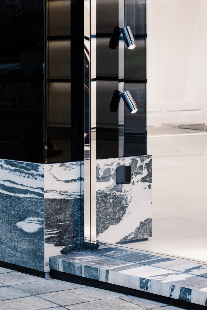
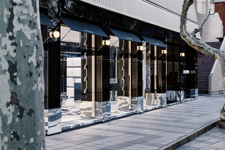
The architectural exterior of CASA is created with simple and clean black lacquered glass, and the black glossy metal strips are used to close the joints. The combination of the glossy lacquered glass and the stony texture of the black and white marble presents a delicate and sharp temperament from the materials.
CASA的建筑外观由简约、干净的黑色烤漆玻璃打造,并由黑色亮面金属条在拼缝间做了收口,烤漆玻璃的光面感与黑白花纹大理石的石质感的结合,从材质中呈现出细致与利落的气质。
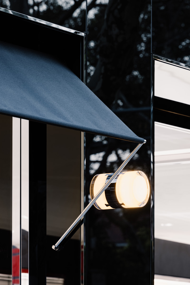
Each window design has a customized canopy and wall lamp, ensuring that each window can fully demonstrate the "home scene."
每一跨度的橱窗设计上则留有定制雨棚与壁灯,保证每一个橱窗能完整地演绎出”居家场景“。
The space still uses black and red as the main color scheme. The strong contrast between black and red, and the smooth and glossy texture of the materials can reveal the brand's attitude from the moment of entering the space.
空间依旧沿用了黑与红作为主基调,黑与红的强烈对比以及材质平滑与具有光泽度的质感,从步入空间开始便能透析出品牌的态度。
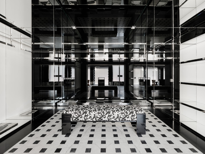
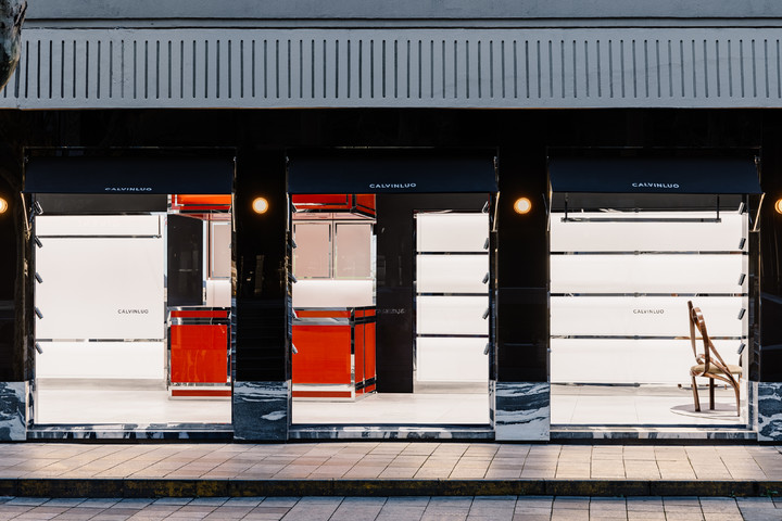
The interior is divided into three functional areas: the dining room, the art lounge, and the walk-in closet, which are arranged in an "L" shape. The dining room and the art lounge areas are clearly visible from the windows along the street.
室内从客餐厅、艺术会客厅和步入式衣橱三个功能区以”L“形围绕展开,客餐厅与艺术会客厅两个区域从沿街面的窗口便能清晰可见。
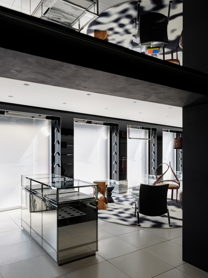
The walk-in closet is "hidden" at the back of the space, and the closet space surrounded by three display surfaces and the black and white checkered floor tiles create a conflicting feeling, making the overall space more layered.
步入式衣橱则”隐藏“在了空间的后端,三面展示面围合出的衣橱空间与黑白棋盘格地砖形成了冲突感,使整体更富有层次。
say architects drew inspiration from CALVINLUO's fashion elements to infuse more details into the space, transforming the brand's strong and sharp tailoring lines and metal buckles into matching design language.
say 从 CALVINLUO 的系列服装元素中汲取灵感让空间赋予更多的细节,服饰中硬朗的剪裁线条与金属锁扣都转化为相匹配的空间设计语言。
From the straight expression of the overall space lines to the intricate rectangular metal cuts on the entrance door handle, as well as the left and right ends of the display clothes rail taking shape from the brand's iconic square metal buckles, the fine details of the clothing are presented in the space.
从整体空间线条的直率表达再到入口的门把手的凹凸错落的矩形金属切割,以及陈列衣杆上取形于品牌标志性的方形金属锁扣的左右端头,都将服饰中的精工细节在空间中得以呈现。
The simple and powerful architectural space serves as a background, while the artful home decor serves as a balance to the space.
简洁有力的建筑空间作为背景,艺术家居则作为了平衡空间的调剂。
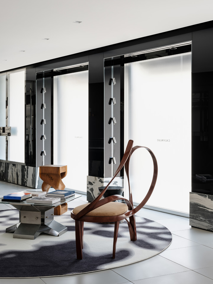
The art living room features the CATARACT CHAIR and FLOOR LAMP IV designed by RAKA STUDIO, and the twisting and swirling natural white wax wood contains a soft and flowing emotion, perfectly conveying a dual expression of granite straightness and sensual beauty.
艺术会客厅选用了来自RAKA STUDIO设计的CATARACT CHAIR与FLOOR LAMP IV,扭转盘旋的自然白蜡木富含着柔美流动的情绪,恰到好处地传递出帅气率性与感性柔美的双向表达。


